07 June 2023
HOWDY
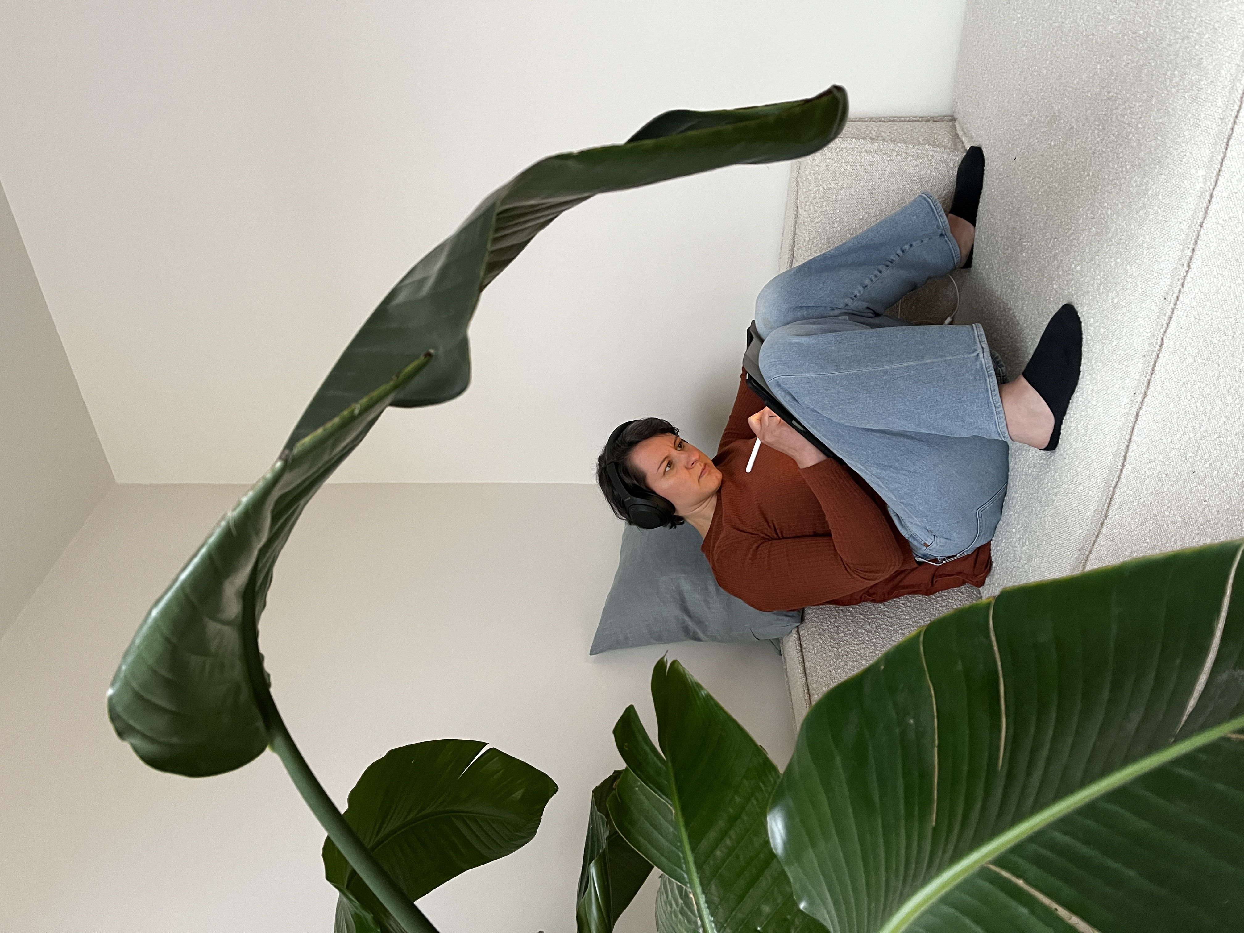
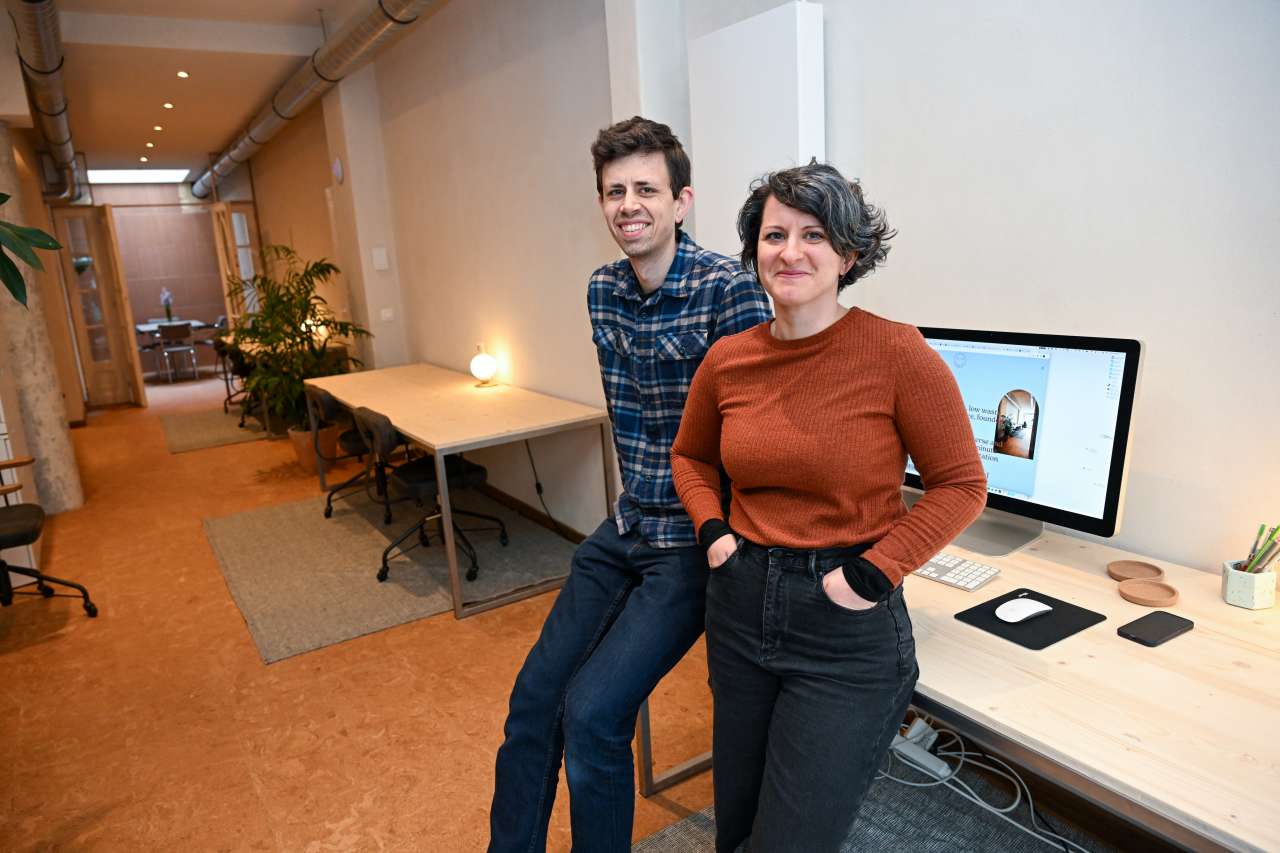
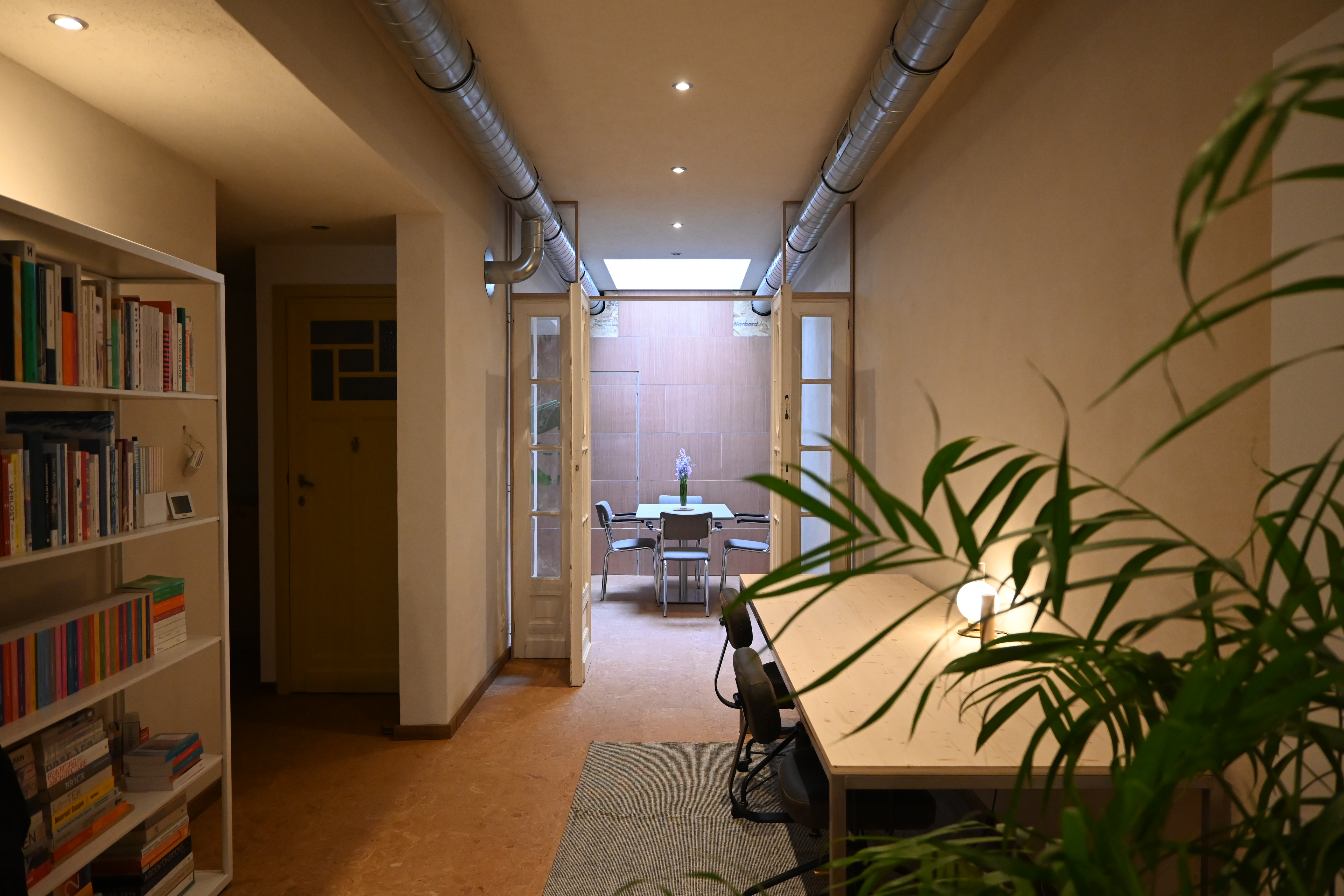
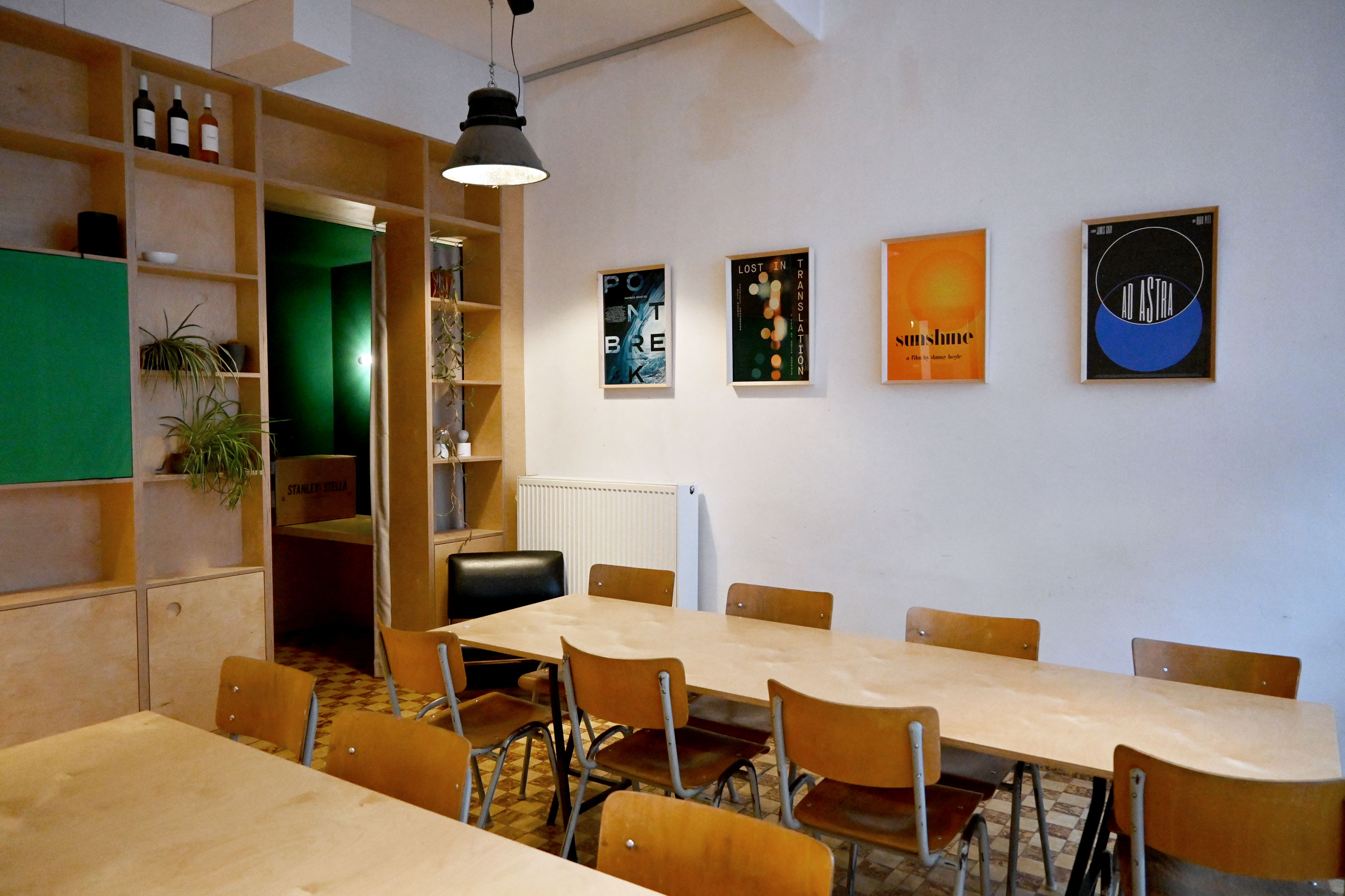
Wow, it’s been over a year since I updated this journal! I haven’t been sitting still, or actually we haven’t been sitting still. As of November 2021 I have been one half of doublebill.design, hence the dwindling activity on my own website. My life partner and colleague Mathieu and I have been working hard on book projects, on our alternative film poster project, on our vegetable garden, on our apartment, and more recently on our very own studio space.
Over a period of three months we transformed an empty shop into a sustainably renovated and eco-friendly decorated coworking space: Howdy. It’s a culmination of our growing knowledge of environmentally-friendly building materials and techniques, along with our interest in (second-hand) interior design and running a low-waste and shared office space. Some photos below. If you’re in the neighbourhood: come check it out! You can find us at Statiestraat 140 in Berchem.


10 January 2022
EXPO Double Bill Posters
Three years ago my collaboration with Mathieu started with a self-initiated project: Double Bill Posters. It was a way to combine our mutual interests in film and design, away from client briefs, and as an exercise in quick thinking and doing.
And our first expo opened today! We are showing a selection of our alternative film posters, mostly from our third year, but also including some standouts from the first and second year. It takes place in our favourite local coffee bar, Kornél.
You can order this selection of twelve posters as high-quality giclée prints in either A3, A2 or B2 format, via doublebill.design/shop or in Kornél. Giclée is a technique where pigmented inks are printed in several layers on special paper, resulting in intense colours, deep contrasts and high resolution – lasting for 80 years or longer without fading. Our designs will be printed on demand by Superdruk. More info on doublebill.design!
22 November 2021
Coming soon! Wilder koken: Vol. I – Lentekruiden
An applied botany for culinary purposes with practical information about 24 recognisable wild spring plants and how to make them shine in the kitchen.
Available for preorder now! Send me an email to reserve your copy, the books will ready to ship or pick-up from December 15th.
352 pages on FSC recycled paper, hardcover quarter bound with linen. Printed by L.capitan at Graphius, bound by Brepols.
With text, recipes and photographs by Natalie Schrauwen. Design, production and proofreading by doublebill.design (aka Mathieu Vancamp and myself). Ceramics by GHESQ. Published by ELDER.


14 October 2021
And another one bites the dust: Ben er voor je! off to print
Research indicates that depressive feelings among young people have tripled during the corona crisis. Mental health is a hot topic, but more importantly: it saves lives. In Ben er voor je! (I’m here for you!), Instagrammer Jamie-Lee Six and journalist Julie Vranckx don’t shy away from taboos and share tips to take care of yourself, your family and your friends. A big one: talk about it and get help!
With illustrations by @lauradoodles and icons by topform8.
Available soon from Horizon!


12 October 2021
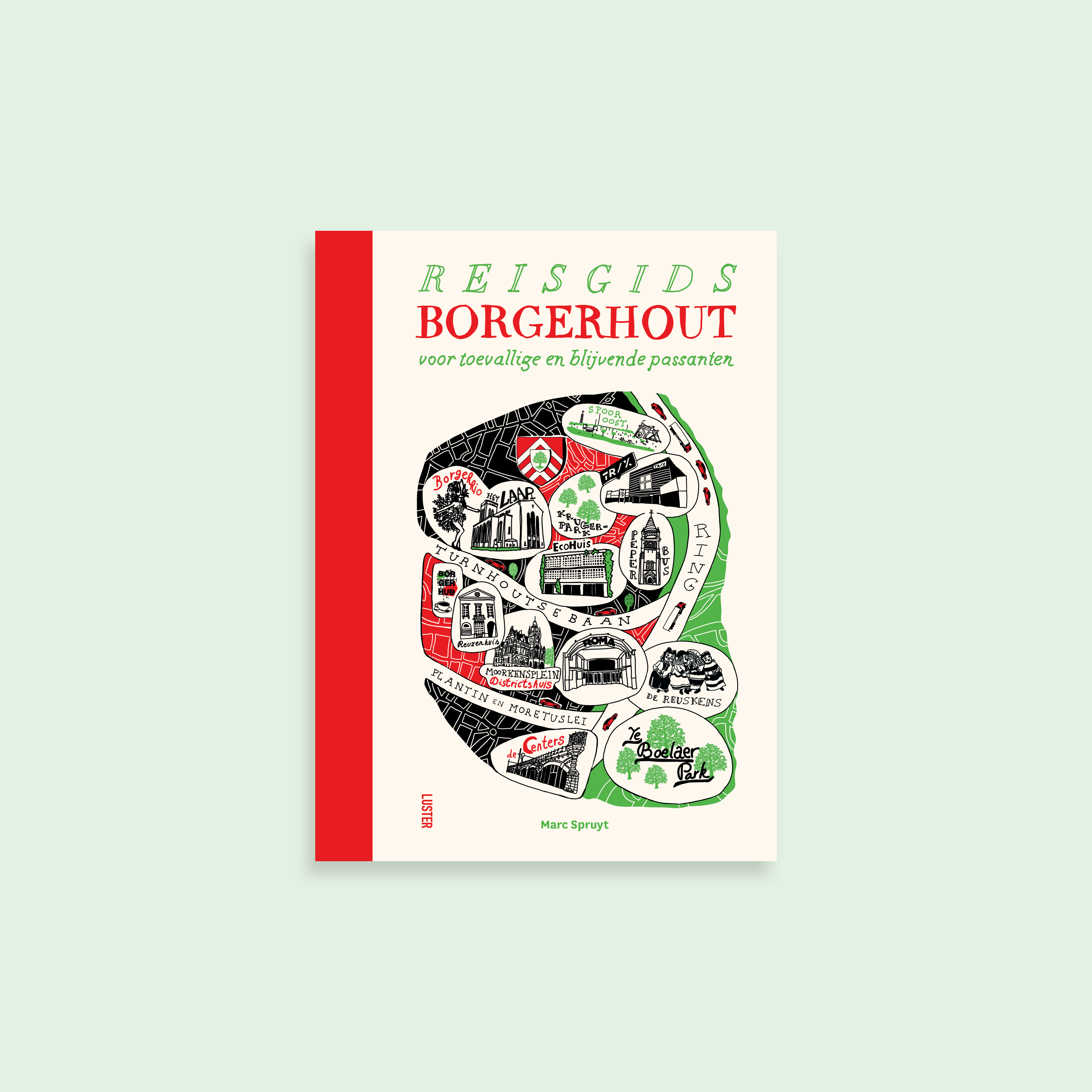
Reisgids Borgerhout off to print!
Another fine book sent off to the printer: Reisgids Borgerhout, a travel guide (with a bit of time travel) to Antwerp’s quirkiest and most diverse neighbourhood, written by journalist Marc Spruyt. Cover illustration by Fenna Bouve.
Available soon on the Luster website!
Another fine book sent off to the printer: Reisgids Borgerhout, a travel guide (with a bit of time travel) to Antwerp’s quirkiest and most diverse neighbourhood, written by journalist Marc Spruyt. Cover illustration by Fenna Bouve.
Available soon on the Luster website!


24 September 2021
De kleine wandelgids off to print!
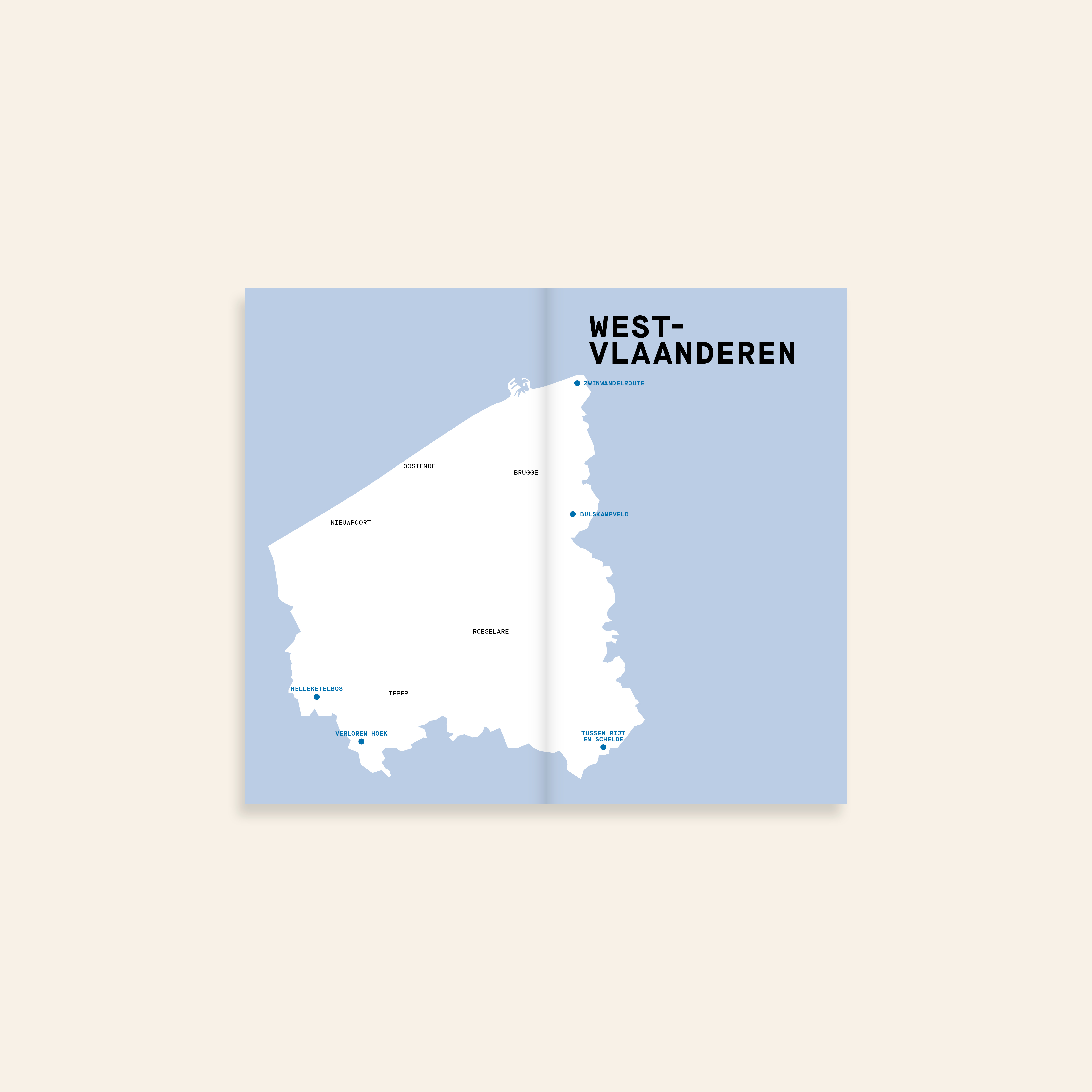
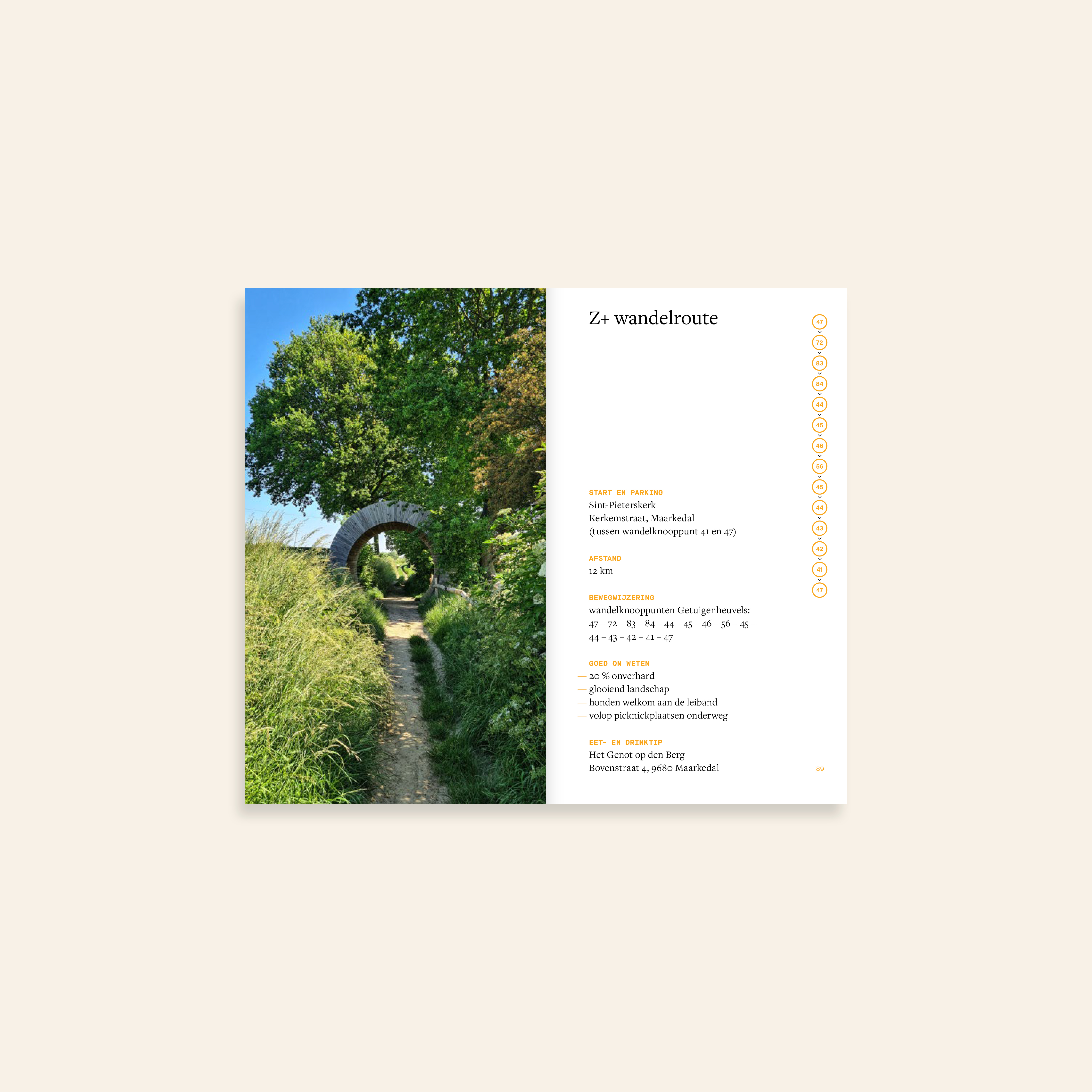
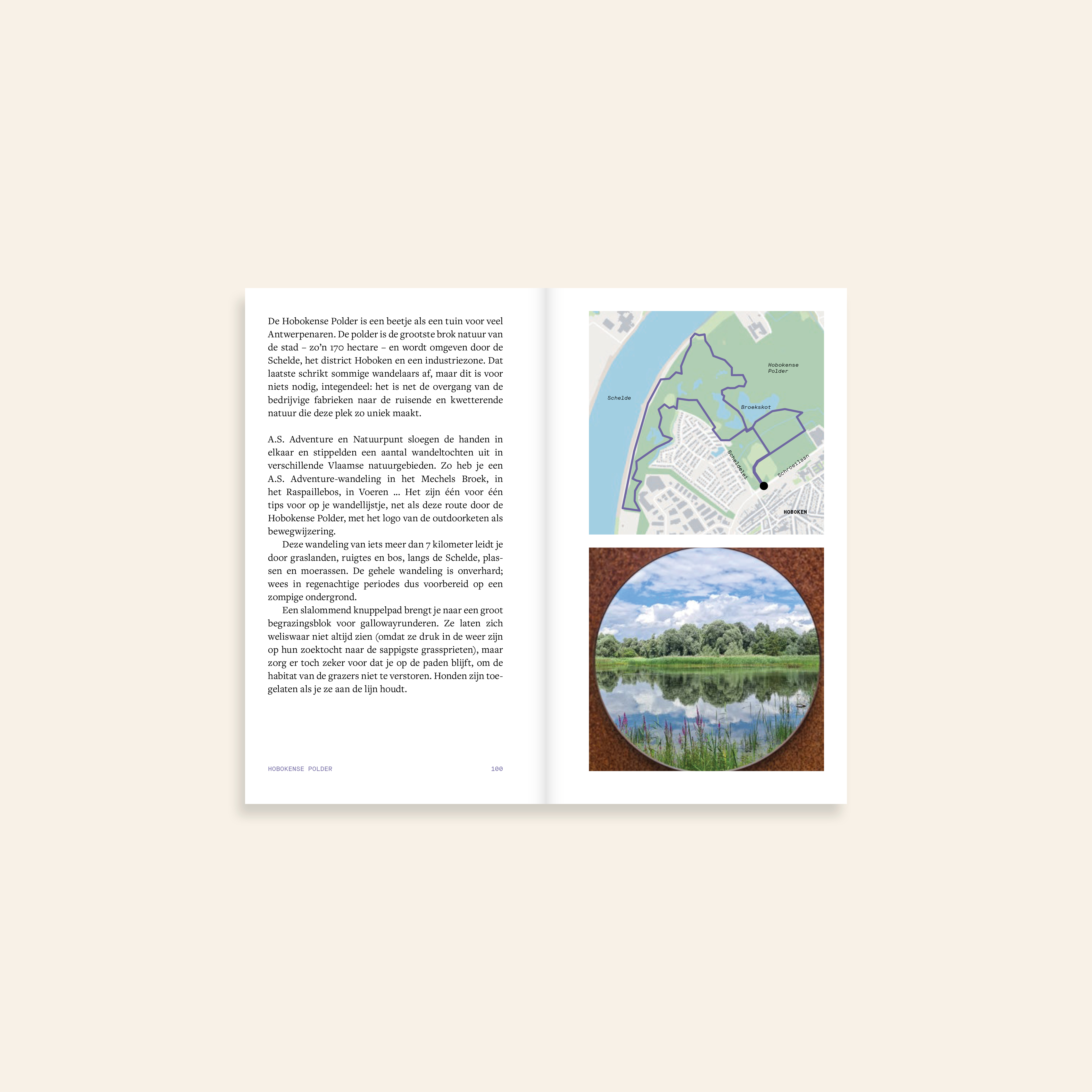
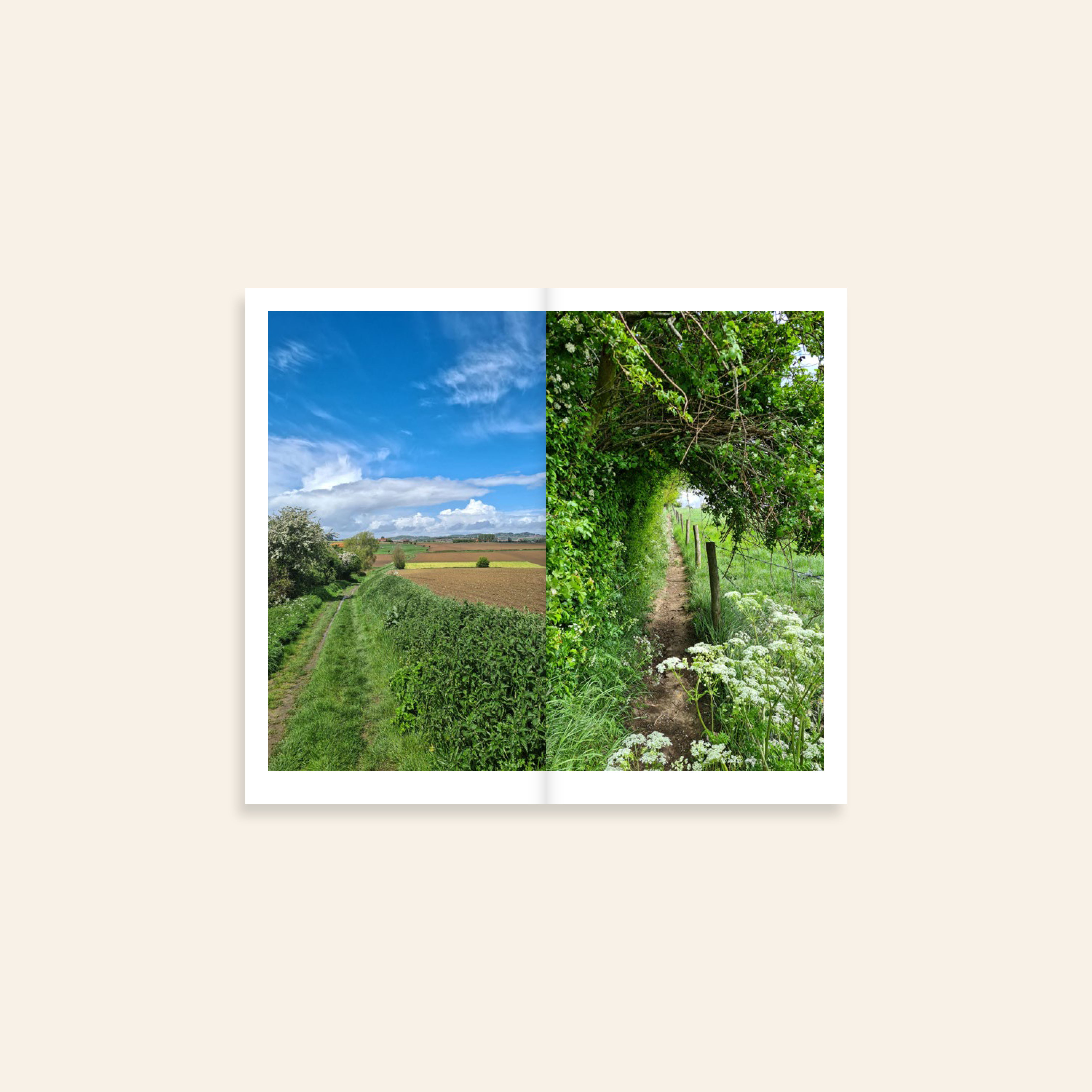
Before the global pandemic, Lus De Ridder started bundling her most treasured walking routes in Belgium on the Instagram account @staycation.belgium. For obvious reasons, travelling in our own countries boomed in the past years, so her account grew exponentially. Lus picked her 25 favourite walks in the Flemish region of Belgium for this little pocket-sized book.
Each walk has four spreads: an overview page with all the details (starting point, parking, good to know, drinking or sleeping tips), a description of the route, sights and things to do in the neighbourhood, supplemented by a route map (made by myself and Mathieu Vancamp) and photographs that give you a sense of the different landscapes you will encounter on that walk.
Available soon on the Luster website!

23 July 2021
The launch of doublebill.design
Earlier this month, my partner Mathieu and I took our relationship to the next level… We launched doublebill.design: a new name, website and webshop for our joint work, self-initiated projects and limited edition art prints.
Earlier this month, my partner Mathieu and I took our relationship to the next level… We launched doublebill.design: a new name, website and webshop for our joint work, self-initiated projects and limited edition art prints.

6 May 2021
Into the Woods off to print!
Journalist and slow traveler Laura Claessens aka @amongpinetrees presents 25 cabins, treehouses and stylish getaways situated in the finest woods and pastures of Belgium and The Netherlands. The inner pages will be printed with a fifth colour: Pantone Green U.
Into the Woods was a really fun book to design and it made me dream of carefree times and relaxed holidays… Soon!
More info about the book (which is in Dutch) on the Luster website. The book is currently available for pre-order and will be available in stores from May 29th.


15 March 2021
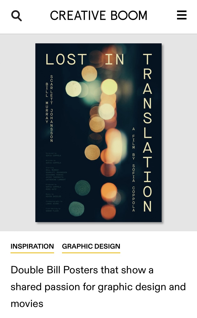
Double Bill Posters featured on Creative Boom
The self-initiated film poster project by Mathieu Vancamp and me, Double Bill Posters, is featured on Creative Boom! We started with DBP at the end of 2018, as a way to combine our mutual interests (graphic design and film) away from client briefs. You can read more about our journey in the Creative Boom write-up. And give us a follow on the DBP Instagram!
The self-initiated film poster project by Mathieu Vancamp and me, Double Bill Posters, is featured on Creative Boom! We started with DBP at the end of 2018, as a way to combine our mutual interests (graphic design and film) away from client briefs. You can read more about our journey in the Creative Boom write-up. And give us a follow on the DBP Instagram!
24 February 2021
Britt bij de bijen off to print
After a quiet summer and winter, February has been a busy month catching up with titles that were postponed last year. The third book sent to print this month is my first children’s book – written by Belgian radio/tv presenter and beekeeper Britt Van Marsenille and illustrated by Katrien Vanderlinden.
After a quiet summer and winter, February has been a busy month catching up with titles that were postponed last year. The third book sent to print this month is my first children’s book – written by Belgian radio/tv presenter and beekeeper Britt Van Marsenille and illustrated by Katrien Vanderlinden.

23 February 2021
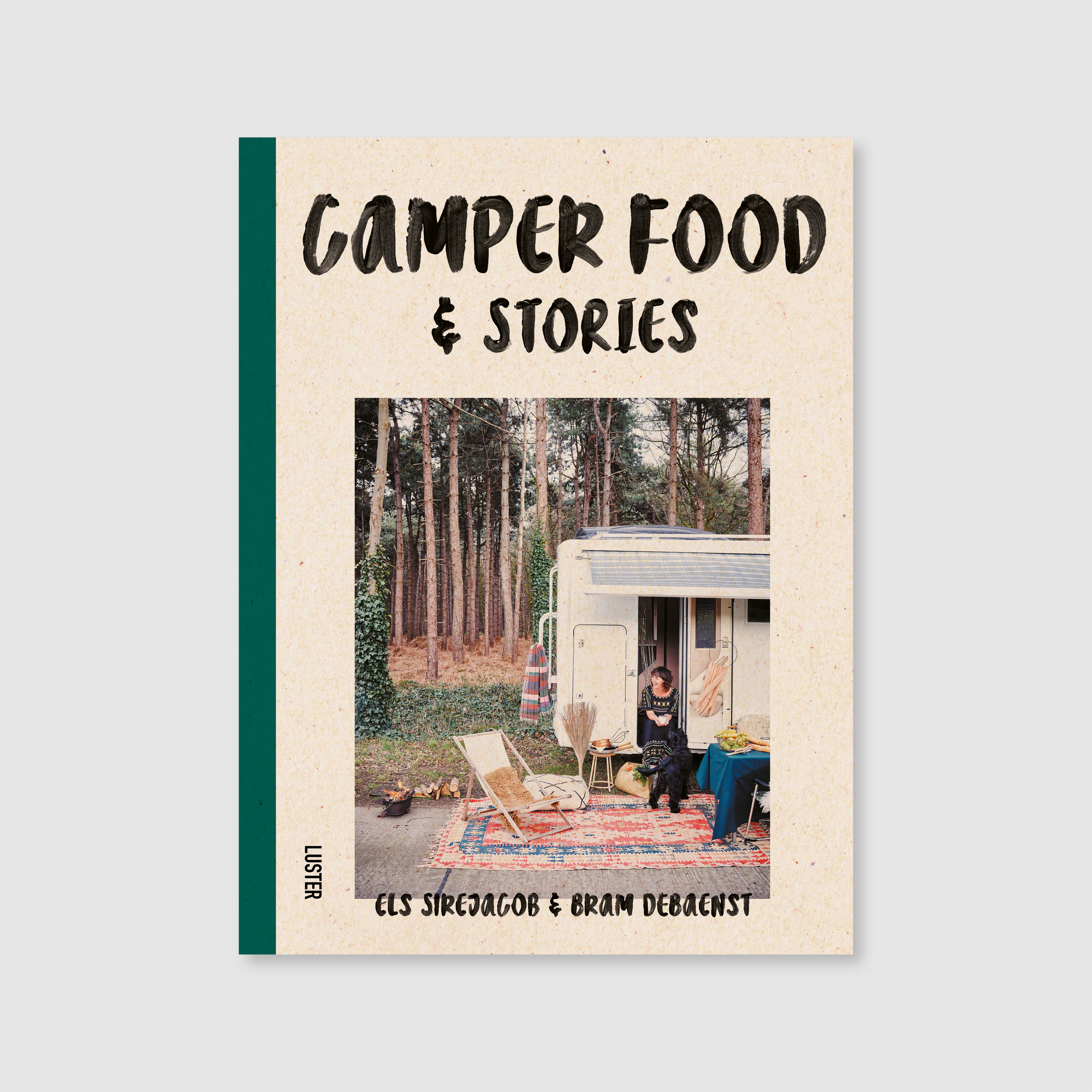
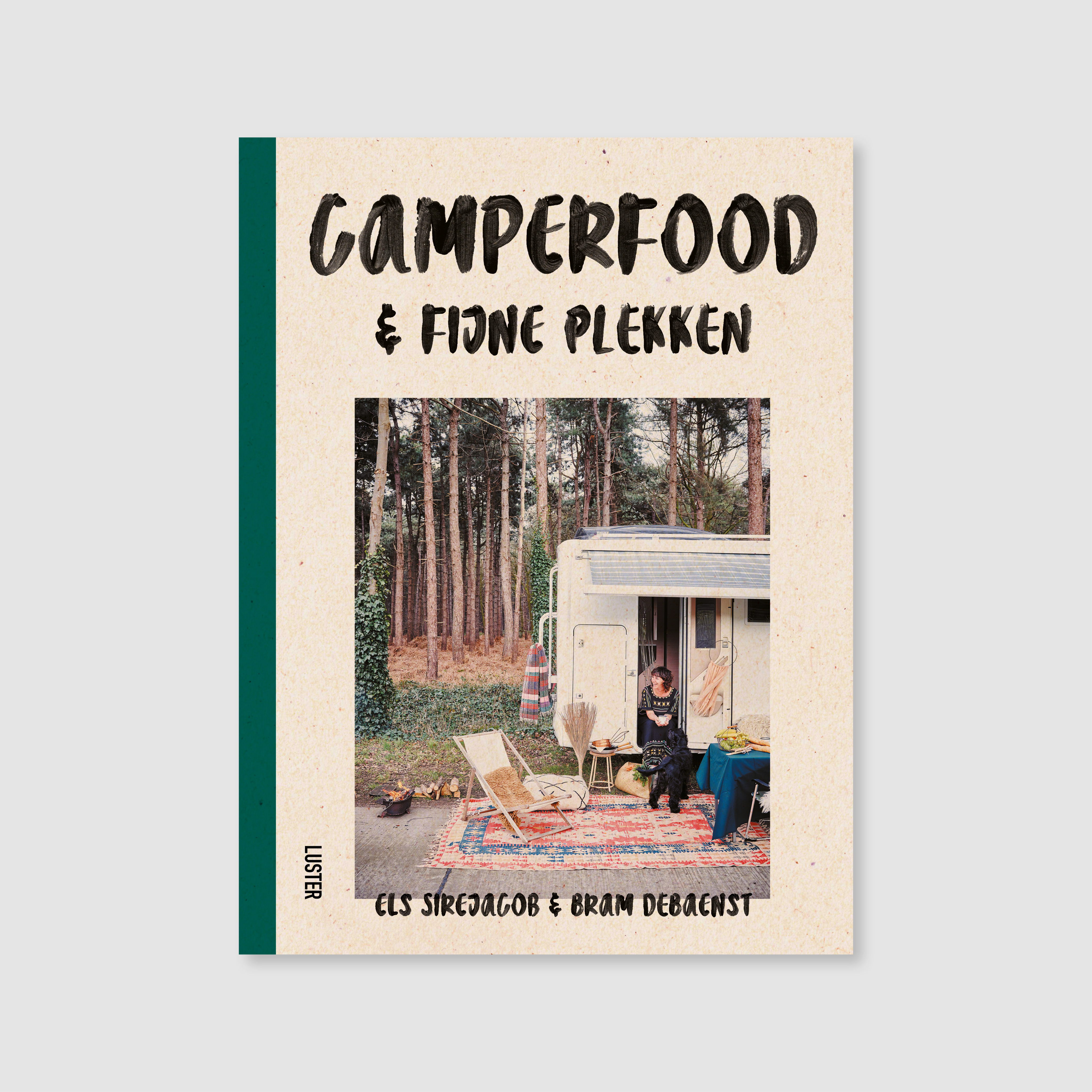
Camper Food & Stories off to print
The English and Dutch editions of Camper Food & Stories by food stylist Els Sirejacob and food photographer Bram Debaenst were just sent to the printer in Italy. This book is the result of their shared passion for camper van travelling and slow cooking – an ode to life on the road as well as to good, pure and flavourful food. It’s making me look (even more!) forward to summer…
The covers will be printed on Favini Remake: a paper made from upcycled leather residues.
02 February 2021
A Midsummer Night’s Dream … off to print
Shakespeare x Dzama: A Midsummer Night’s Dream, the second title in the David Zwirner Books Seeing Shakespeare series, was just sent to the printers in Italy. Artist Marcel Dzama’s pieces are vibrant and engaging, can’t wait to see this book in person! You can see the first book in the series, Shakespeare x Ofili: Othello, here.
Shakespeare x Dzama: A Midsummer Night’s Dream, the second title in the David Zwirner Books Seeing Shakespeare series, was just sent to the printers in Italy. Artist Marcel Dzama’s pieces are vibrant and engaging, can’t wait to see this book in person! You can see the first book in the series, Shakespeare x Ofili: Othello, here.

14 January 2021
And… that’s a wrap!
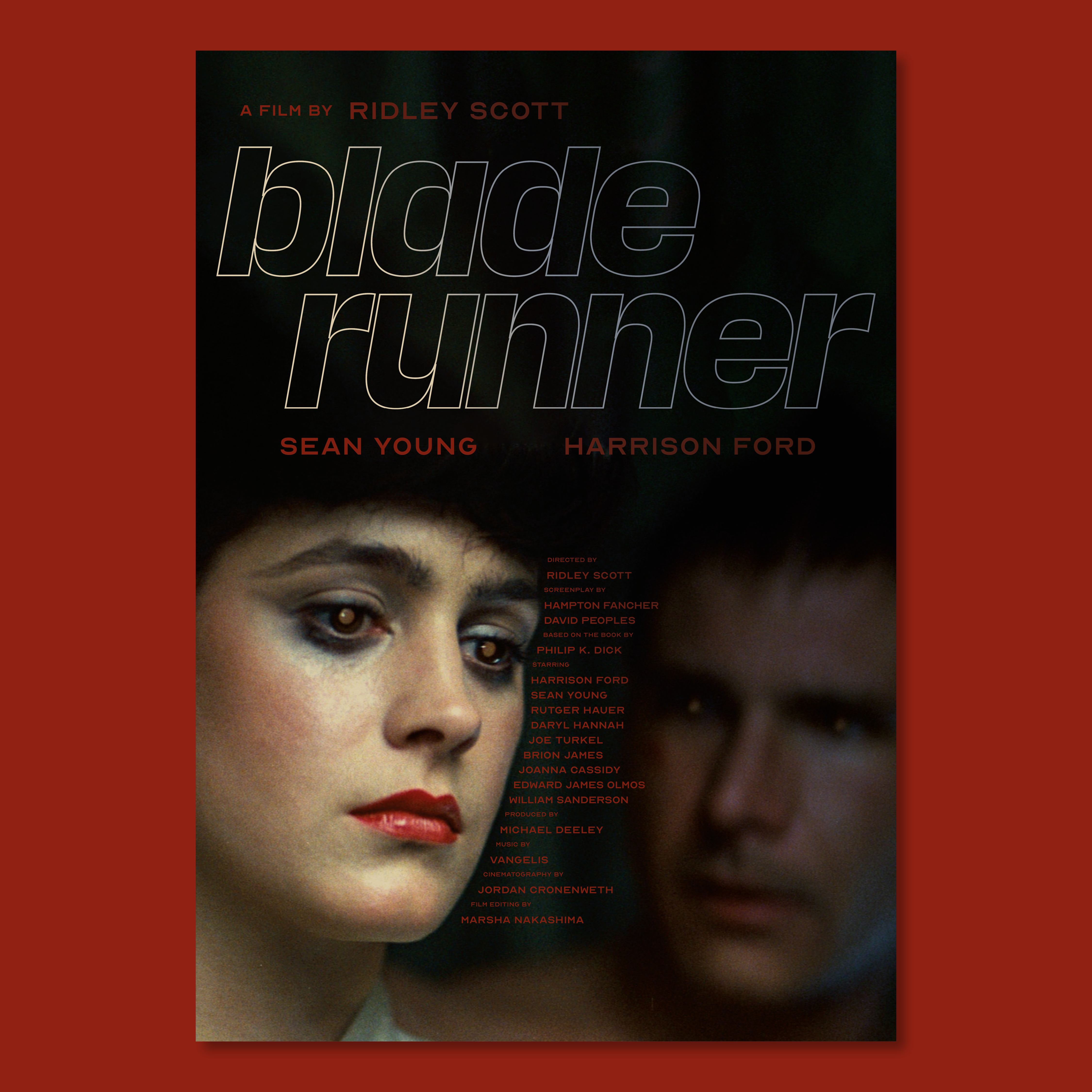
With a bit of a delay we finalled wrapped up our second year of Double Bill Posters. This year we treated one film genre per month and designed a poster for two representative films in that genre. Our twelfth and final genre was sci-fi, my favourite! The first poster was designed quite quickly, but we were really stuck on Blade Runner. Designing a poster for a movie and genre that you really like is much harder… You can check out all of our 2020 pieces here. And we’ll jump right into our new 2021 concept soon!
With a bit of a delay we finalled wrapped up our second year of Double Bill Posters. This year we treated one film genre per month and designed a poster for two representative films in that genre. Our twelfth and final genre was sci-fi, my favourite! The first poster was designed quite quickly, but we were really stuck on Blade Runner. Designing a poster for a movie and genre that you really like is much harder… You can check out all of our 2020 pieces here. And we’ll jump right into our new 2021 concept soon!


4 January 2021
Happy & healthy 2021! 🍀
I don’t think we’ve ever needed the mental reset of a new year as much as we did just now. It’s been a tough one, and it’s not over yet, but we’ll get there.
⠀⠀⠀⠀⠀⠀⠀⠀⠀
In the past few months Mathieu and I finally had some time to design our own postcards, which we wanted to produce in an eco-friendly way: Boekenbergdrukt uses vegetable-based inks (rice bran oil from agricultural waste, to be precise) on her secondhand Risograph printer and she only stocks papers that are recycled and/or made from waste. We picked Favini Crush Kiwi, made with 40% post-consumer recycled waste and 15% agro-industrial waste, in this case kiwi process waste (which is mainly its characteristic hair) while using 100% green energy. We wanted to make people smile, so we had our own bpost stamps made… #couplegoals 🤓
⠀⠀⠀⠀⠀⠀⠀⠀⠀
These were our holiday cards for family, friends, colleagues and clients. They are multipurpose though, because of the abstract graphic (our initials), so we’ll keep using them in 2021 as well. Would you like to get one in 🐌 mail? Let me know! (Our custom stamps are only valid in Belgium.)


12 October 2020
Coming soon: 100 Belgian Icons
Currently on an Italian printing press is 100 Belgian Icons, the new brainchild of Derek Blyth and Luster. ‘This affectionate cultural guide celebrates 100 icons that make Belgium different from any other country. In 100 short, informative texts, the author talks about food, people, places, traditions, inventions, buildings, and even expressions, that have shaped what he calls “the strangest country in the world”.’
An ode to our fair but weird little country. With beautiful illustrations by architecture student Emma Verhagen. Published by Luster.
1 October 2020
Back after a long hiatus!
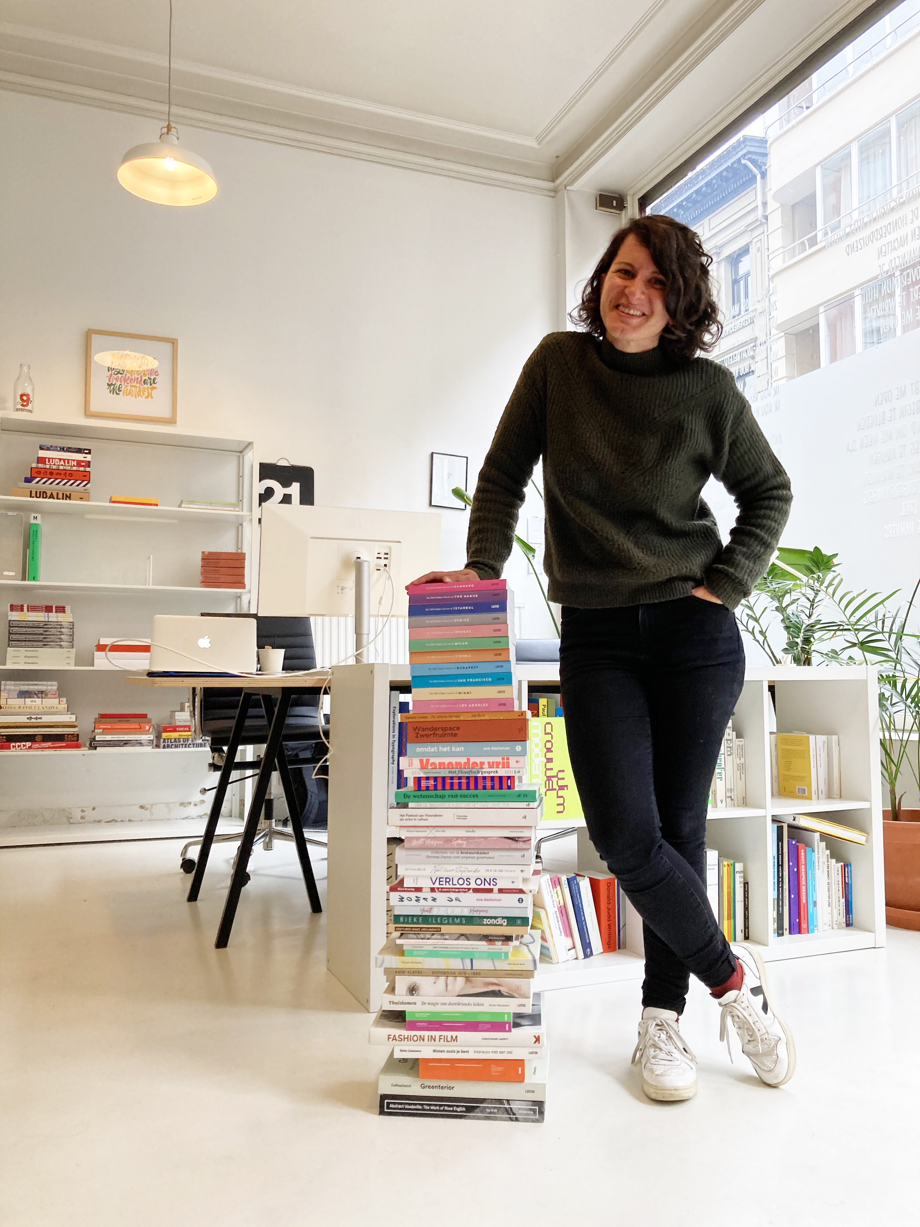
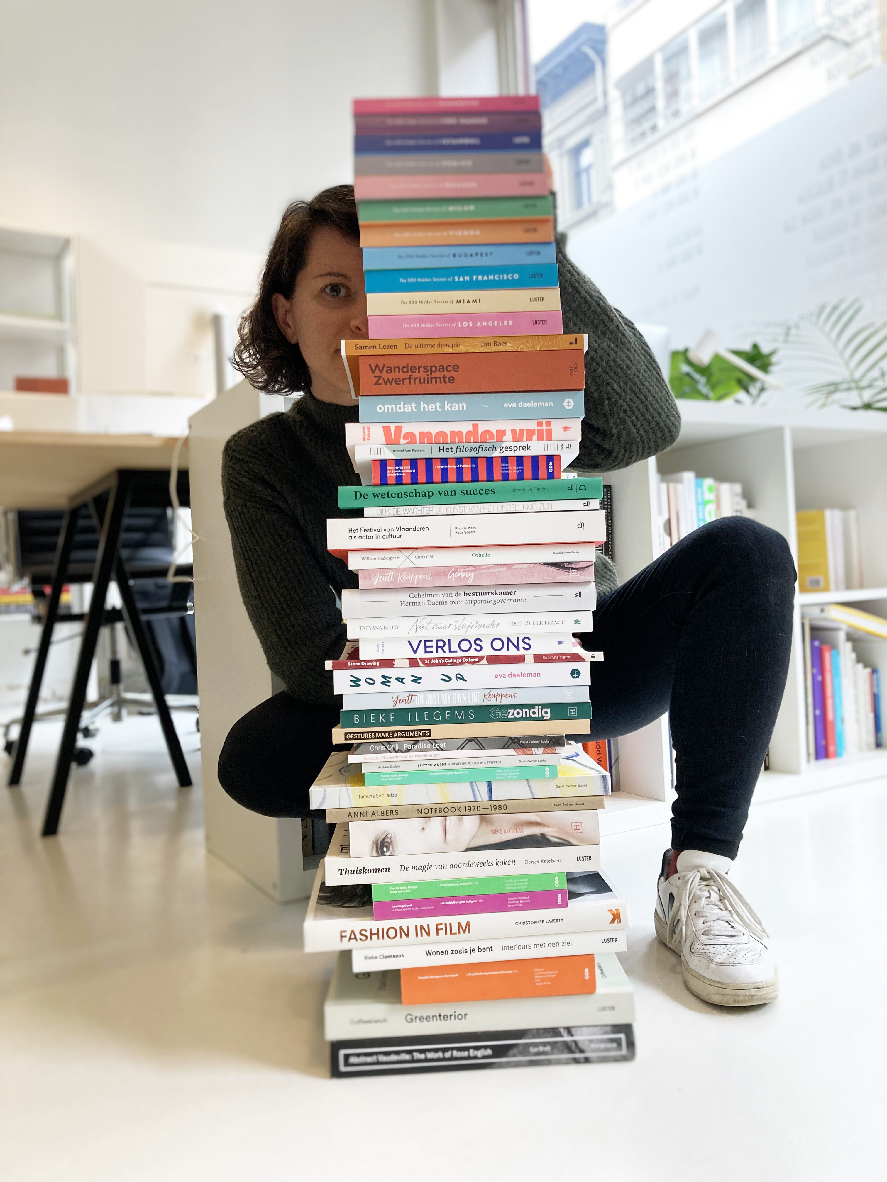
It’s been two months since my last journal entry. Because of the epidemic, my busy summer schedule suddenly looked very empty: nearly all of my projects were moved to next year, or postponed indefinitely. We spent these two otherwise idle months renovating one of the flats above ours, but when that was finished it became very noticeably how little work we actually have. A few requests came in last week, so I hope this signals a start of more work coming our way, even though once again stricter COVID measures were announced today… It’s not over yet, by a long shot! In the meantime we are trying to keep busy with old and new self-initiated projects.
October 1st marks my sixth anniversary of being a self-employed graphic designer in Belgium. For the occassion I stacked up most of the books (a bunch are missing from the pile) I have worked on so far and let myself be photographed with them (which is quite rare).
6 July 2020
Off to print
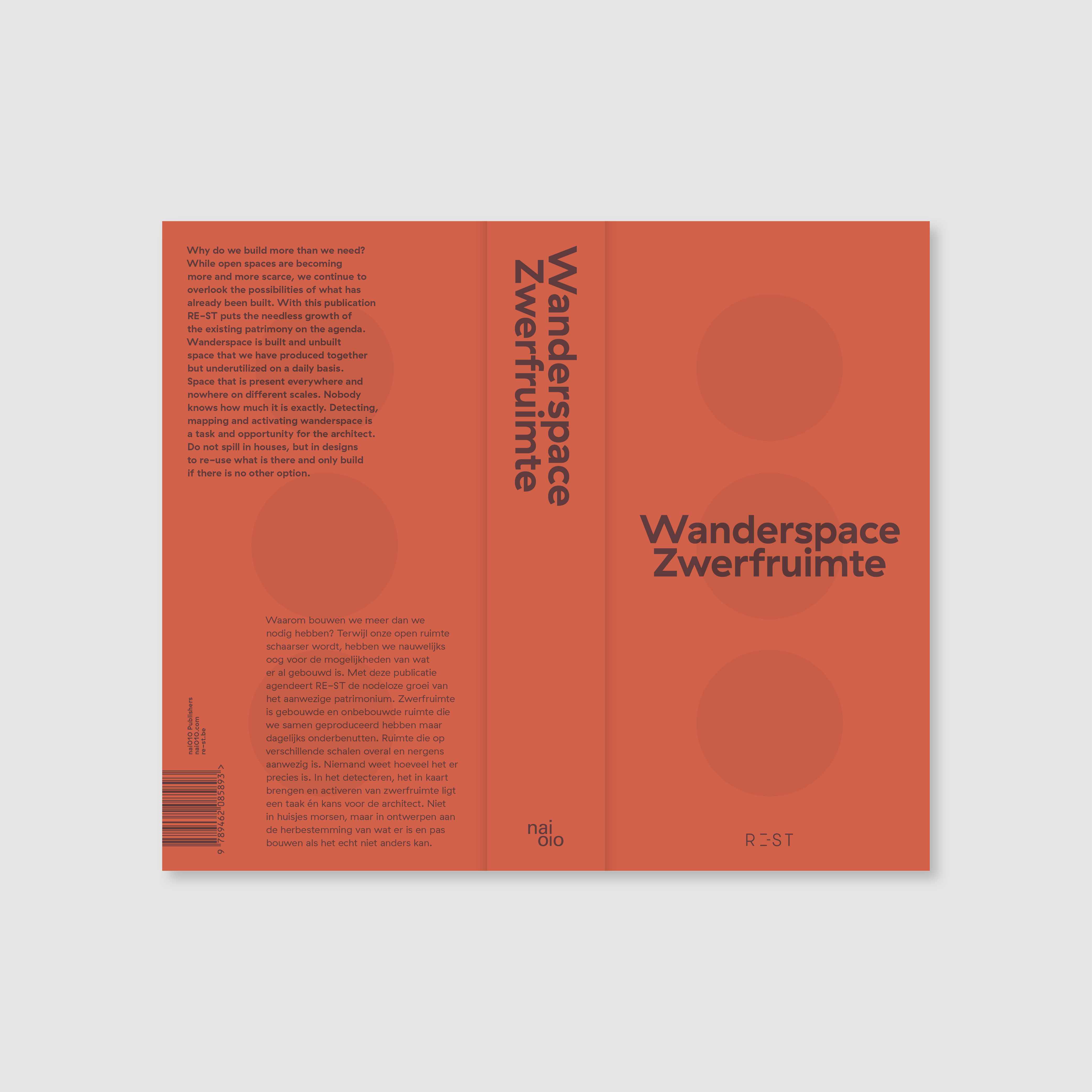
Belgian architecture firm RE-ST researches complex spatial issues and seeks solutions by investigating wanderspace, the ‘built-over or undeveloped space that we have produced together, but underuse on a daily basis.’ For their 10-year anniversary, they compiled this brick-sized book that explores the question: ‘Why do we build more than we need?’
This is an oh-so-important book in our current society, where we run the risk of paving every last bit of open space left. It was a great pleasure to work on this project.
Published by nai010 Publishers. Coming out in September!
30 June 2020
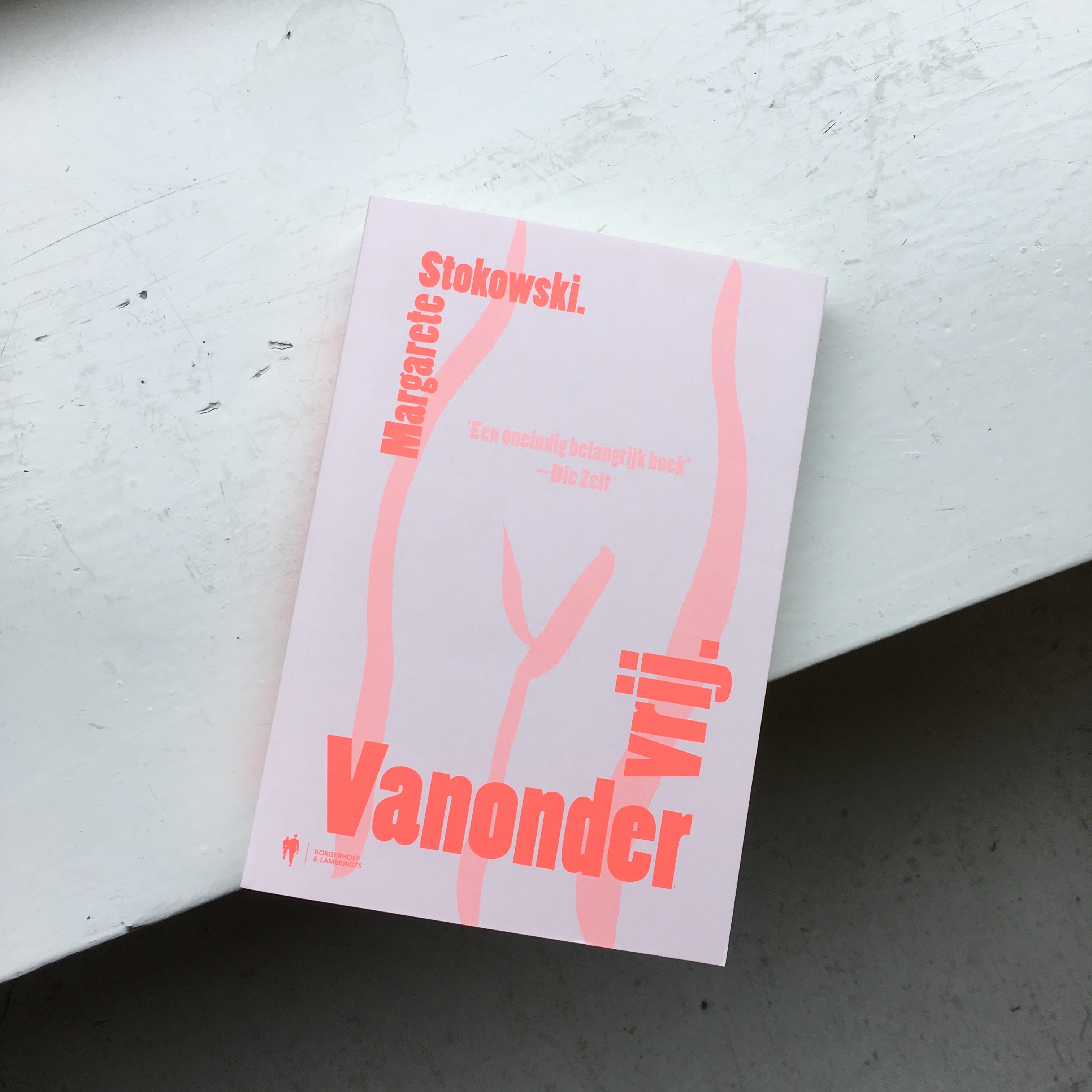
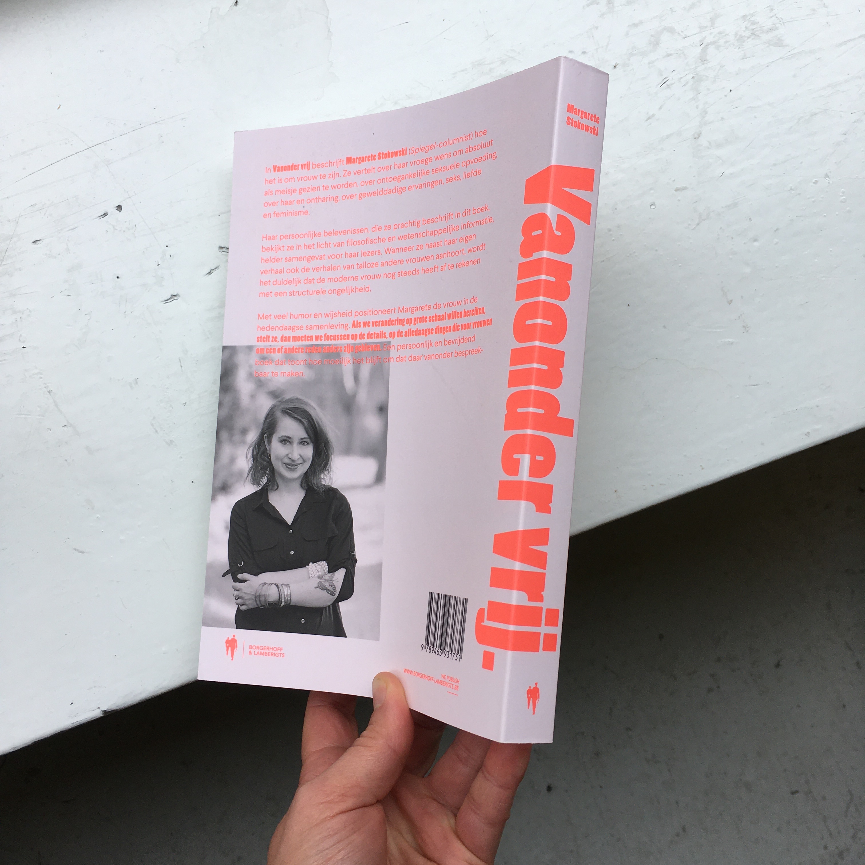
New in
Found this bright paperback in our mailbox this morning! The cover was printed entirely in Pantone 805C, a zesty fluorescent pink that you can’t reproduce on a screen. Always exciting to see ideas come to life on paper. This is also the first time that I made an illustration for a book cover.
Published by Borgerhoff & Lamberigts.
13 May 2020
Off to print
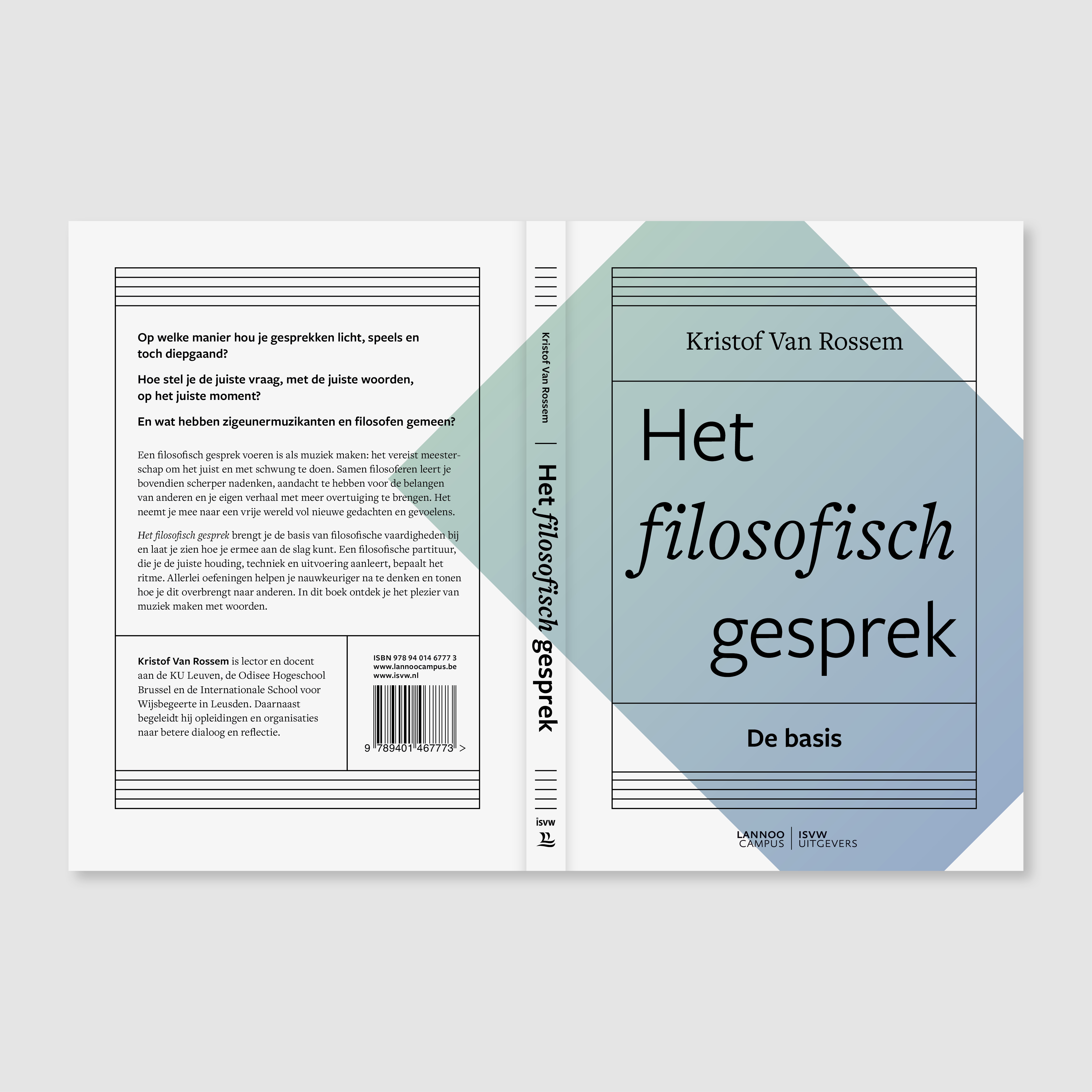
This little book about how to have playful yet deep conversations went to print today. The author compares a philosophical conversation with making music: it requires attention, time, willingness to listen and alertness of mind.
The design of the cover and inside pages is based on this striking comparison between philosophy and music.
More about the book here. Coming out soon!
11 May 2020
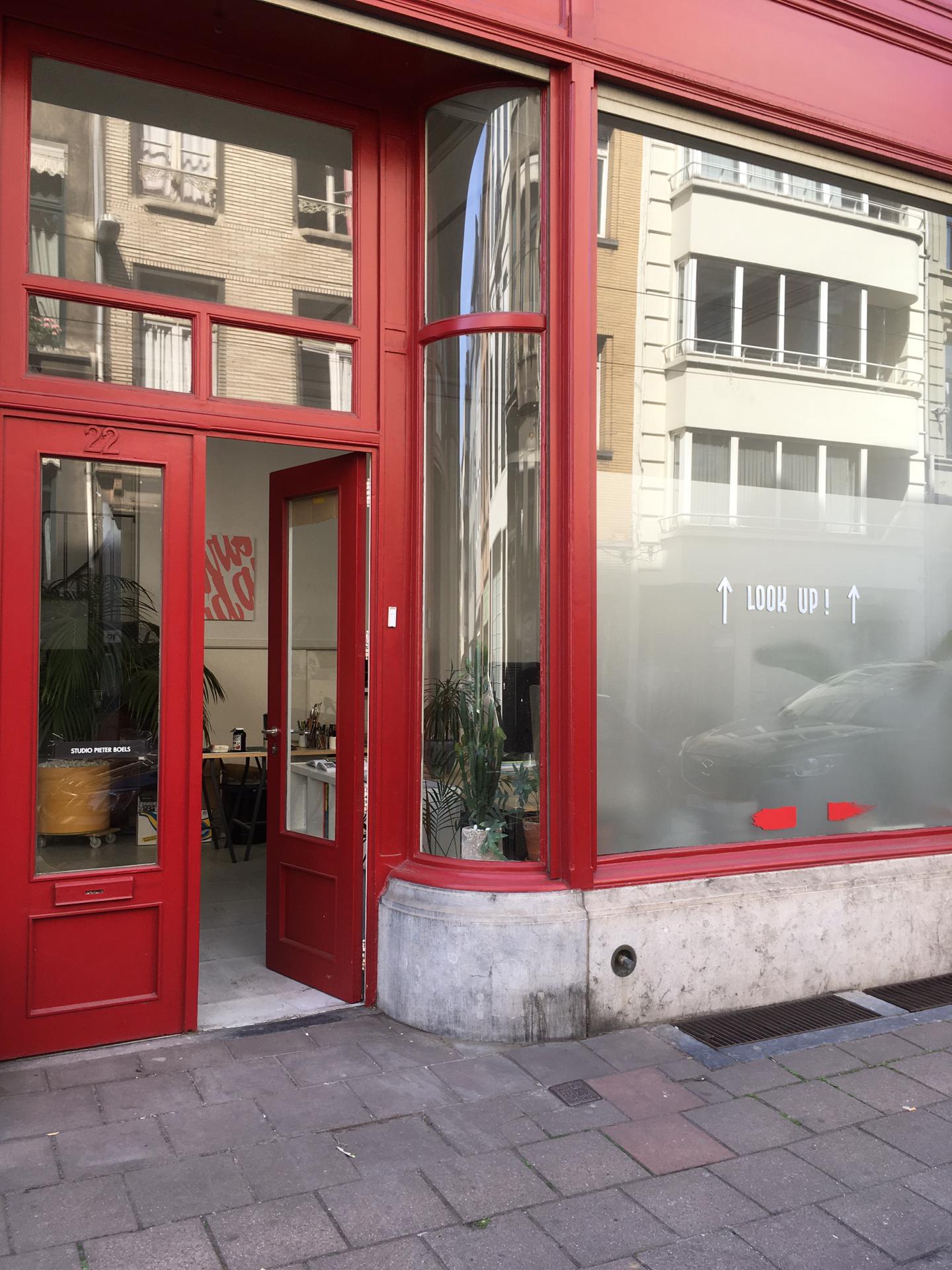
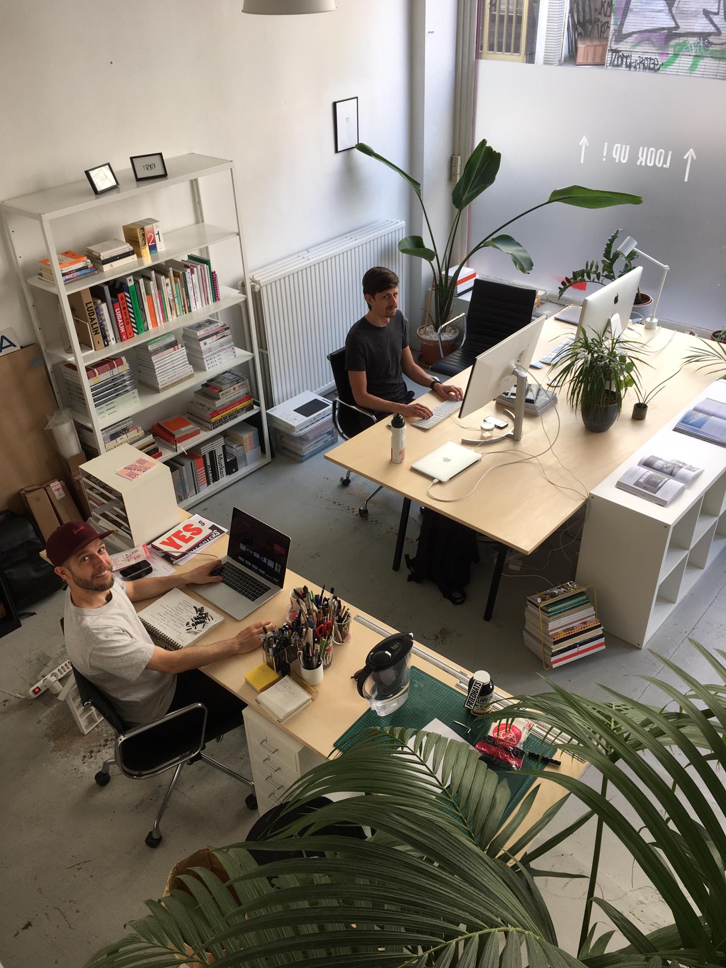
New coworking space
We moved into our new coworking space last week!
Come check out the bright red store front in the Lange Leemstraat in Antwerp. We’re not there every day just yet, and are careful in keeping enough distance between us and our long-time coworking buddy Pieter Boels. But it’s awesome to have a ‘home away from home’ again!
13 April 2020
Life in times of corona
We have been in lockdown for a few weeks now. I’m in good company with Mathieu and our two cats, in our newly-renovated apartment and city garden, with enough design projects (and books and board games) to keep us occupied. In our little cocoon we sometimes forget everything that is happening right now – or rather, how life has been halted. But there is also good news: our planet is given a well-deserved holiday from the abuse, pollution and stress. The air is clearing, and nature moves on. It doesn’t need us, we need it! Let’s take a lesson from this, and incorporate some of the things that we have learned during this time into our ‘normal’ lives. Check out this personal work I made to try and convey this message.
‘In many ways, what we’re seeing now is a rapid and unplanned version of economic “degrowth” – the transition some academics and activists have for decades said is necessary to address climate change, and leave a habitable planet for future generations.’
– Natasha Chassagne on The Conversation
04 January 2020
Happy 2020!
Warmest wishes for the new year and decade ahead. I wrapped up my 2019 accountancy today and started up work again, after a nearly-two-week break (which was very welcome, yet did include a few sick days).
⠀⠀⠀⠀⠀⠀⠀⠀⠀
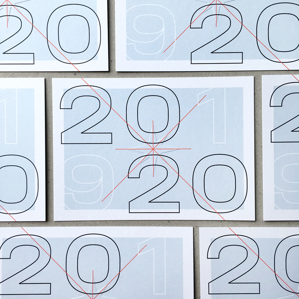
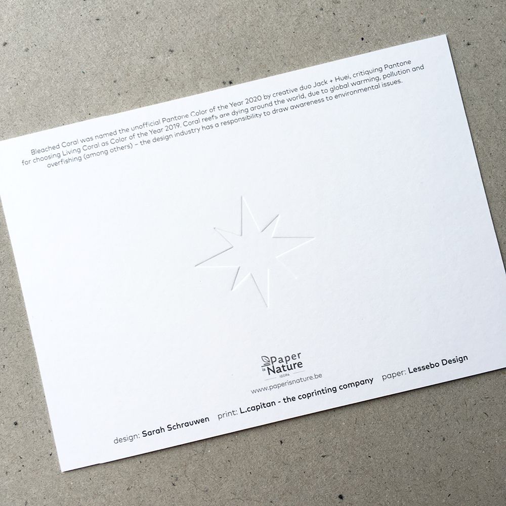
In November, co-printing company L.capitan asked a few graphic designers to design a holiday postcard: there was no brief, but they would blind emboss a star in the centre of the card. I’m not used to working without a brief or content, but knew that I wanted to play off the embossing by adding an asterisk (whose lines grow longer according to the golden mean principle). The choice of colour conveys a subtle environmental message, explained on the back:
Bleached Coral was named the unofficial Pantone Color of the Year 2020 by creative duo Jack + Huei, critiquing Pantone for choosing Living Coral as Color of the Year 2019. Coral reefs are dying around the world, due to global warming, pollution and overfishing (among others) – the design industry has a responsibility to draw awareness to environmental issues.
⠀⠀⠀⠀⠀⠀⠀⠀⠀
With that in mind, I’m hoping that lots of your new year’s resolutions lists will include items such as becoming vegetarian or vegan, living plastic free, switching to renewable energy, buying less or even saving the planet. Remember: there is no plan(et) B…
⠀⠀⠀⠀⠀⠀⠀⠀⠀
Cards printed and embossed by L.capitan on Lessebo Design paper.
Warmest wishes for the new year and decade ahead. I wrapped up my 2019 accountancy today and started up work again, after a nearly-two-week break (which was very welcome, yet did include a few sick days).
⠀⠀⠀⠀⠀⠀⠀⠀⠀
In November, co-printing company L.capitan asked a few graphic designers to design a holiday postcard: there was no brief, but they would blind emboss a star in the centre of the card. I’m not used to working without a brief or content, but knew that I wanted to play off the embossing by adding an asterisk (whose lines grow longer according to the golden mean principle). The choice of colour conveys a subtle environmental message, explained on the back:
Bleached Coral was named the unofficial Pantone Color of the Year 2020 by creative duo Jack + Huei, critiquing Pantone for choosing Living Coral as Color of the Year 2019. Coral reefs are dying around the world, due to global warming, pollution and overfishing (among others) – the design industry has a responsibility to draw awareness to environmental issues.
⠀⠀⠀⠀⠀⠀⠀⠀⠀
With that in mind, I’m hoping that lots of your new year’s resolutions lists will include items such as becoming vegetarian or vegan, living plastic free, switching to renewable energy, buying less or even saving the planet. Remember: there is no plan(et) B…
⠀⠀⠀⠀⠀⠀⠀⠀⠀
Cards printed and embossed by L.capitan on Lessebo Design paper.

15 November 2019
Working from home / Working on our home
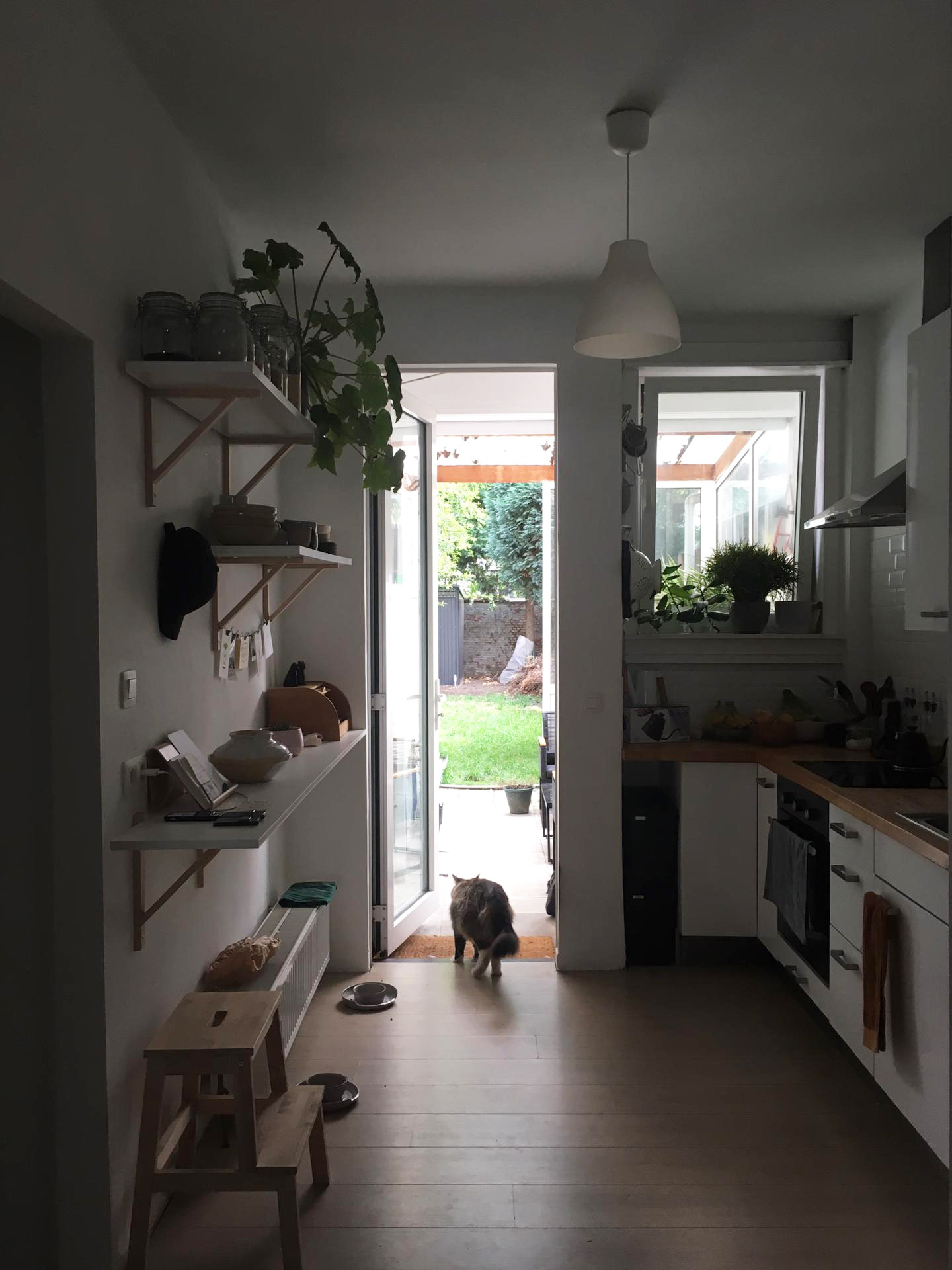
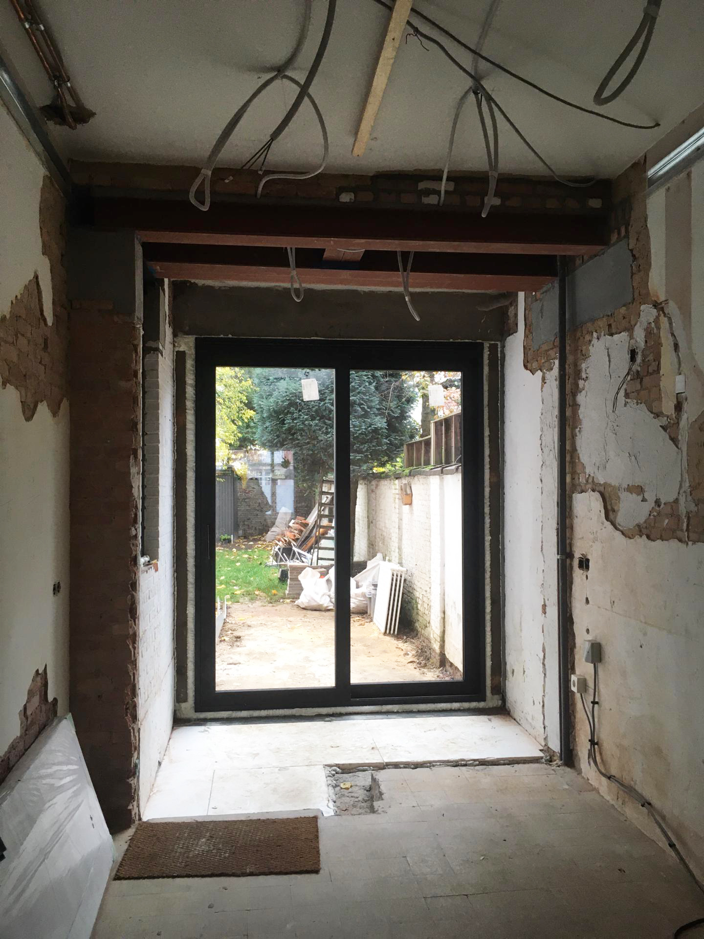
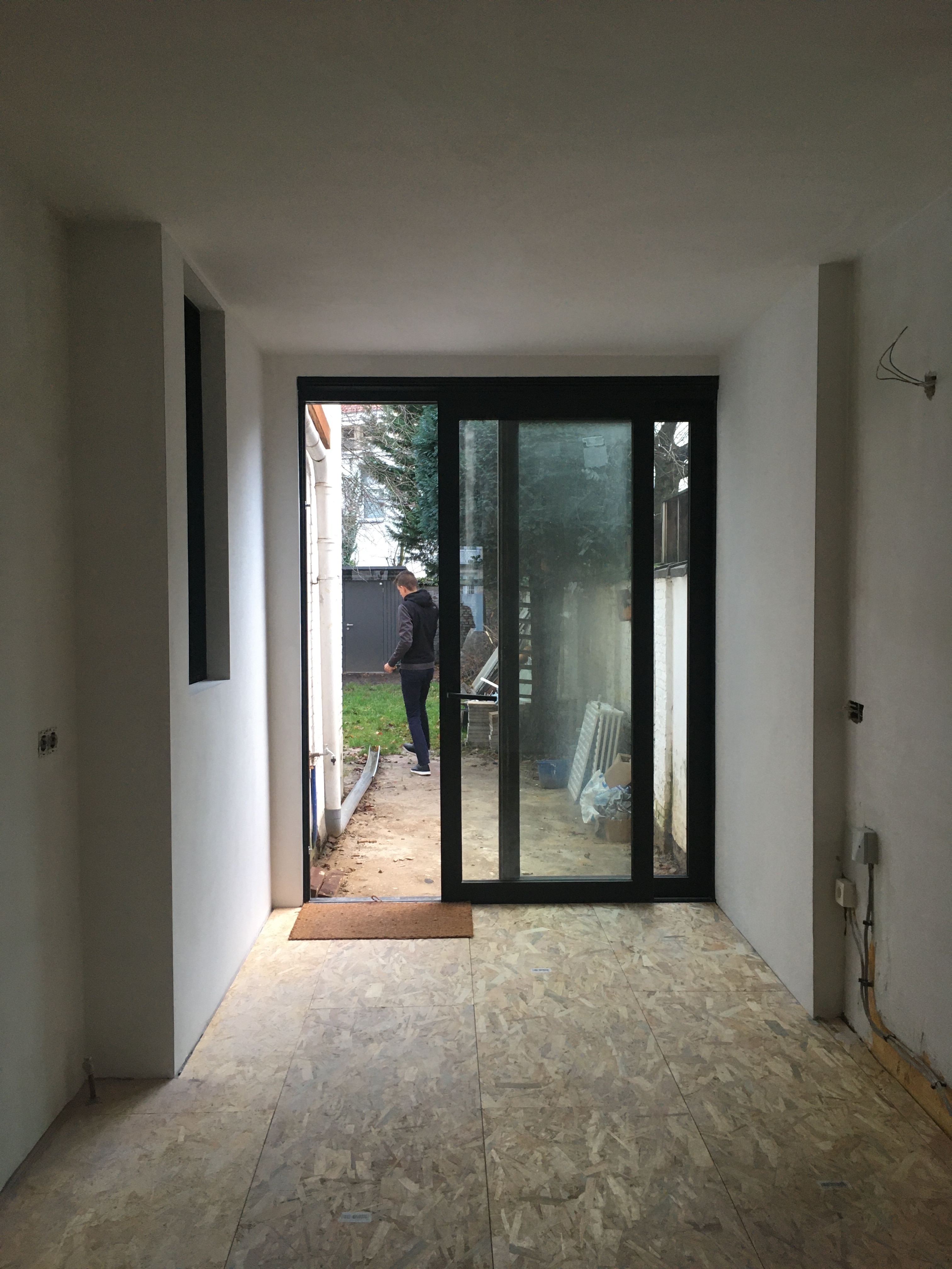
At the end of October we returned the keys of our bright and airy coworking space. Since then, my partner Mathieu and I have been working from home. Well, not exactly our home, as we’re also currently smack dab in the middle of renovating our ground-floor appartment. Fortunately we had the opportunity to move to the second (and top) floor of our building, which has a second, tiny bedroom – and this has become our make-shift office for the next couple of months. Things tend to slow down for me work-wise after summer, so we’ve been able to help out our builders a lot and do as much as possible ourselves. Can’t wait for the final result… We’re aiming to move back in the beginning of February.
Below is a before and ‘after’ (more like ‘during’) photo of our kitchen, one of the biggest transformations.
UPDATE: I’ve added a third photograph of our kitchen (taken 14 December 2019).
24 October 2019
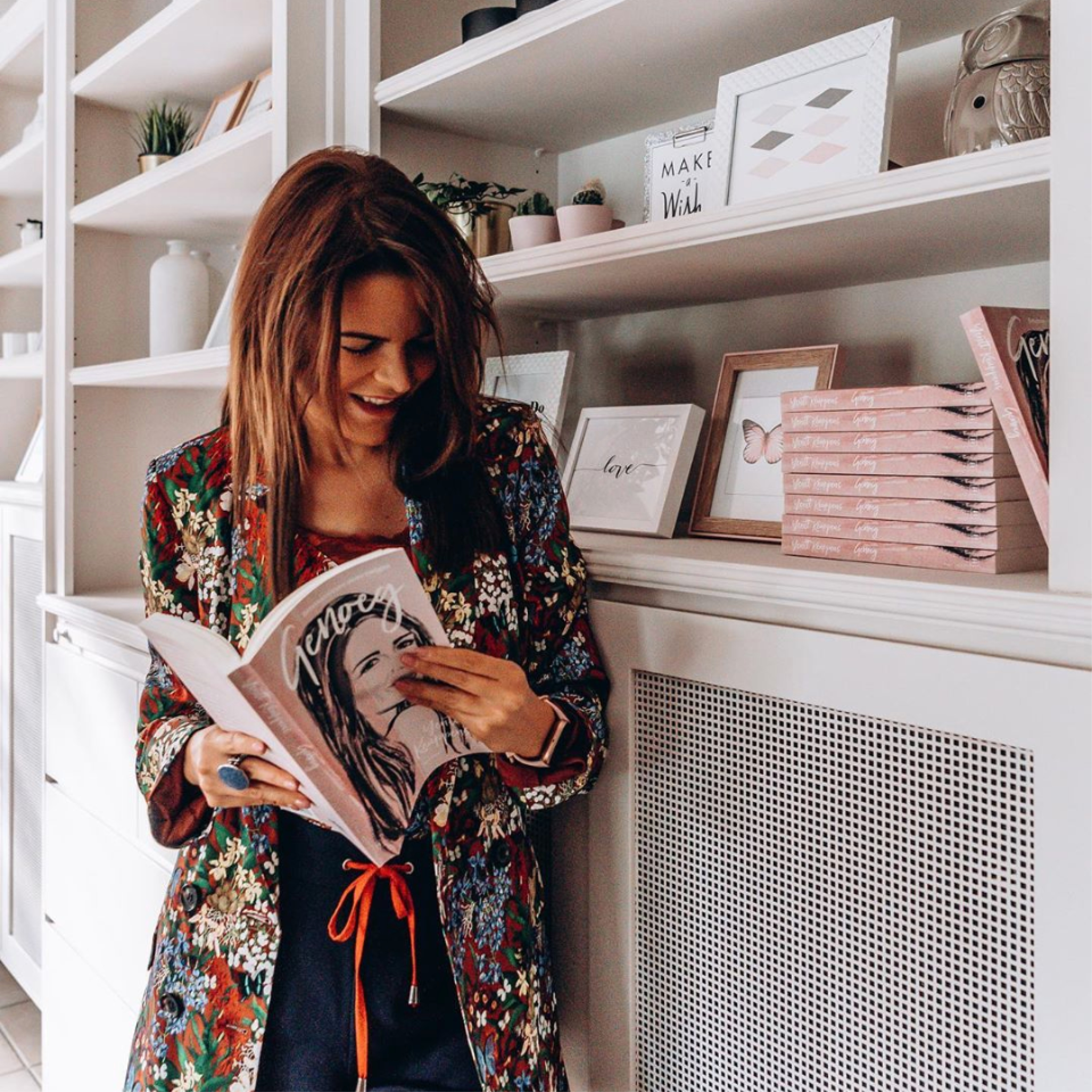
Happy authors showing off their books (with my covers)
From left to right: Yentl Keuppens with Genoeg, Uwe Porters with Verlos ons, and Tatyana Beloy with Nooit meer stiefmoeder!
From left to right: Yentl Keuppens with Genoeg, Uwe Porters with Verlos ons, and Tatyana Beloy with Nooit meer stiefmoeder!


26 September 2019
Off to print – Part V
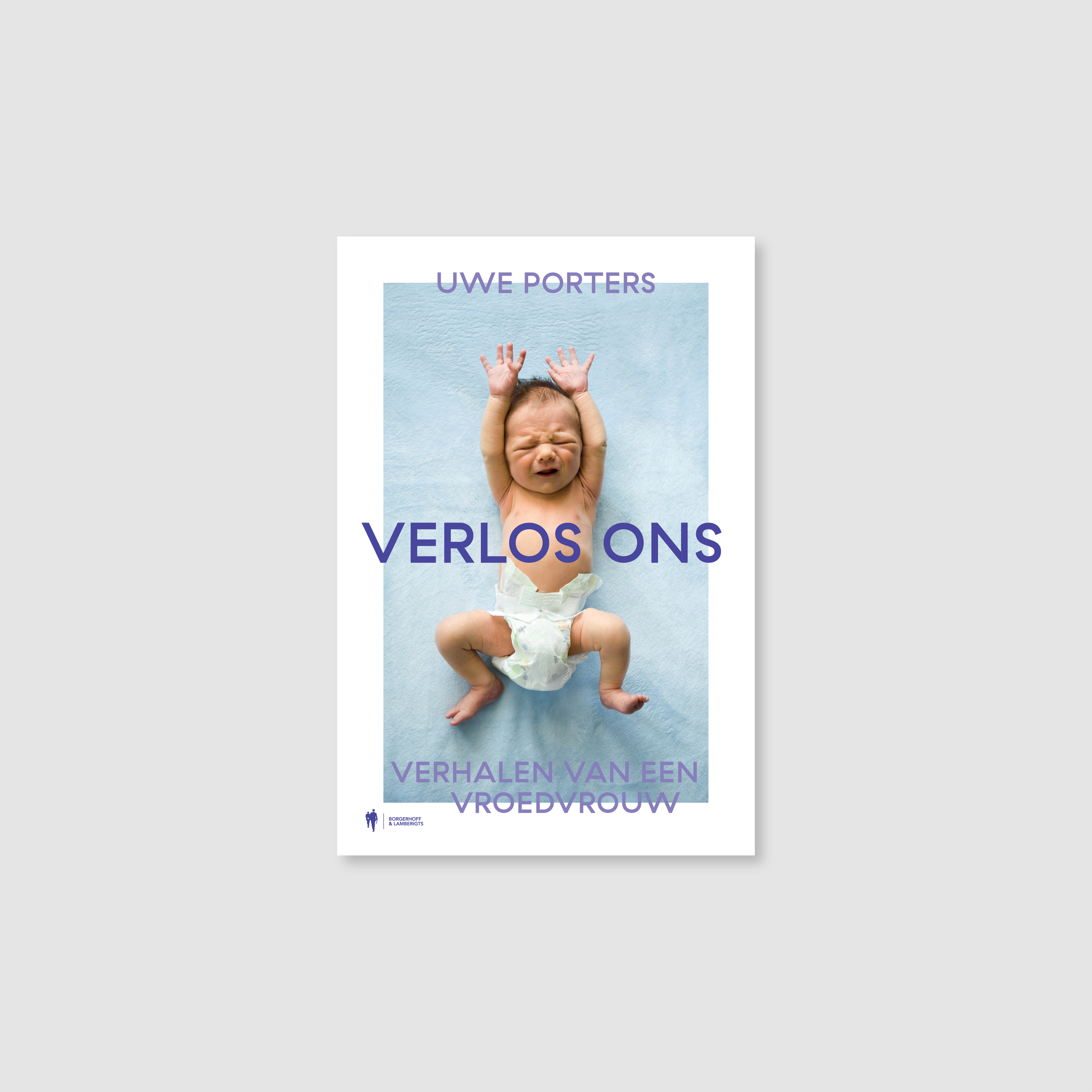
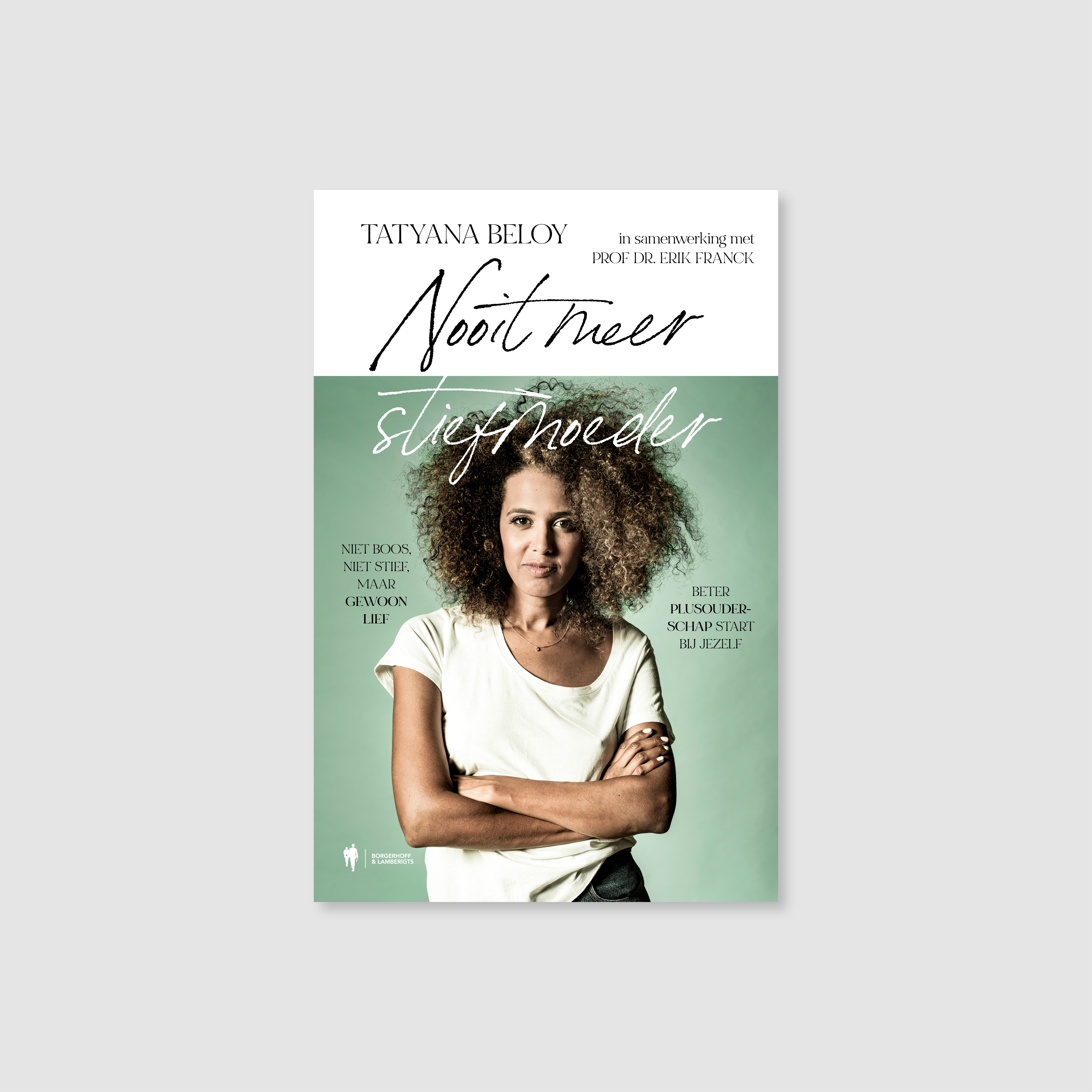
It’s been a busy summer… With new clients! I designed the two book covers shown below for Ghent-based publisher Borgerhoff & Lamberigts. They went to print in the last two weeks. Verlos ons (Deliver us) bundles stories by midwife Uwe Porters. Nooit meer stiefmoeder! (Stepmother, never again!) is a book about ‘plus parenting’, written by actor Tatyana Beloy and professor/therapist Erik Franck.
It’s been a busy summer… With new clients! I designed the two book covers shown below for Ghent-based publisher Borgerhoff & Lamberigts. They went to print in the last two weeks. Verlos ons (Deliver us) bundles stories by midwife Uwe Porters. Nooit meer stiefmoeder! (Stepmother, never again!) is a book about ‘plus parenting’, written by actor Tatyana Beloy and professor/therapist Erik Franck.
22 August 2019
Off to print – Part IV
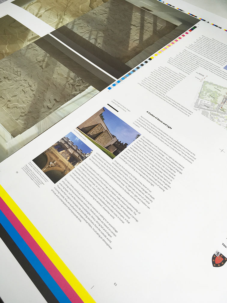
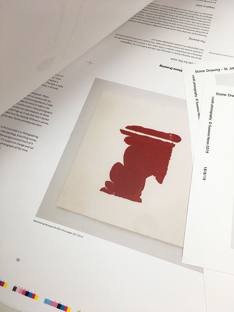
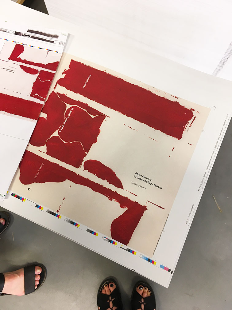
This lovely 64-page book by British artist Susanna Heron went to press earlier this week. The artist’s book will be published to coincide with the completion of her work Stone Drawing (2014–2019), a work of art located on both external and internal faces of the stone wall that forms the west side of the new Library and Study Centre by Wright & Wright Architects at St John’s College Oxford. It will be revealed on September 28th.
Susanna creates site-specific and large-scale pieces, often in stone relief. For the book cover, we decided to emboss one of the original Red Drawings she made at the beginning of this major project.
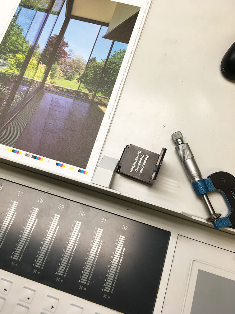
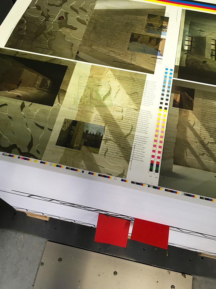
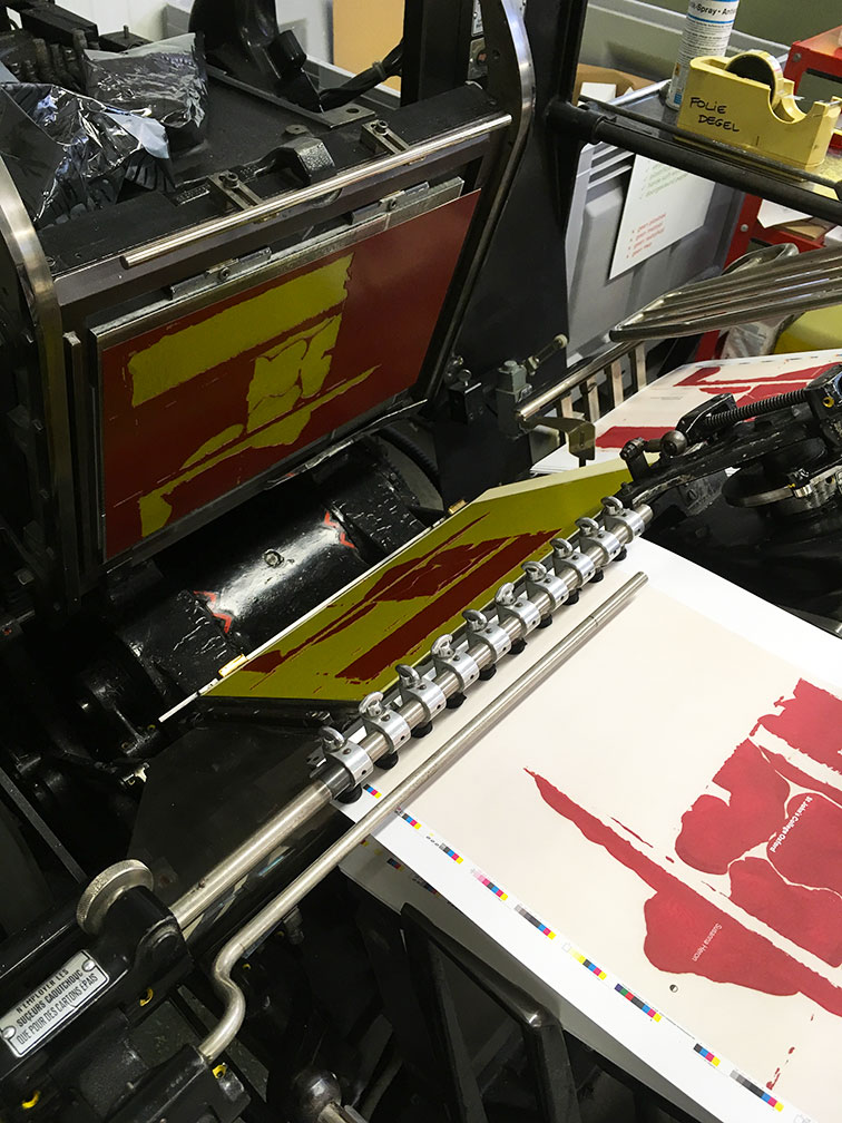
Aside from designing the book, I also managed its production at L.capitan in Ruddervoorde (Belgium). Below are also some photographs from our two press days this week. On the first day we printed the cover and inside pages, and on the second day we embossed the cover.
This lovely 64-page book by British artist Susanna Heron went to press earlier this week. The artist’s book will be published to coincide with the completion of her work Stone Drawing (2014–2019), a work of art located on both external and internal faces of the stone wall that forms the west side of the new Library and Study Centre by Wright & Wright Architects at St John’s College Oxford. It will be revealed on September 28th.
Susanna creates site-specific and large-scale pieces, often in stone relief. For the book cover, we decided to emboss one of the original Red Drawings she made at the beginning of this major project.
Aside from designing the book, I also managed its production at L.capitan in Ruddervoorde (Belgium). Below are also some photographs from our two press days this week. On the first day we printed the cover and inside pages, and on the second day we embossed the cover.

13 August 2019
Off to print – Part III
Two more off to print today: The 500 Hidden Secrets of The Hague and The 500 Hidden Secrets of Hamburg.
Locals tell you where to go in the cities you love – that’s what The 500 Hidden Secrets city guides do. Originally designed by Joke Gossé, I took over the design of the new titles and updates a few years ago. Check out their recently renewed website with great previews of their global destinations!
31 July 2019
Off to print – Part II
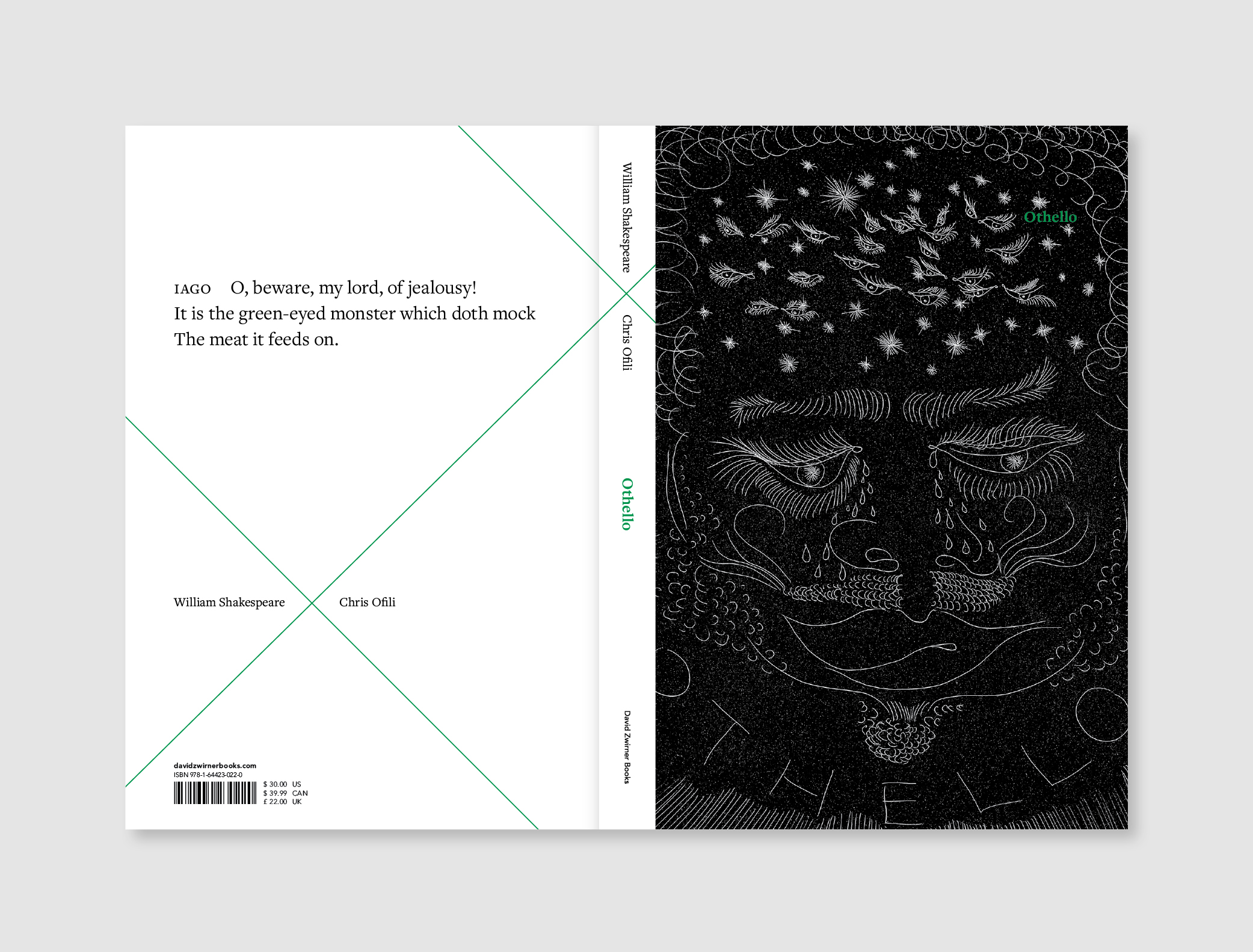
Last night, I sent Shakespeare x Ofili: Othello to print! It’s the first book in a new series by David Zwirner Books, Seeing Shakespeare, bringing the world’s leading contemporary artists together with
William Shakespeare.
Othello remains one of Shakespeare’s most contemporary and moving plays, with its emphasis on race, revenge, murder, and lost love. Contemporary artist Chris Ofili asks us to see in Othello the great injustices that still plague the world today.
It was very exciting to design the template for a book series – I’ve always wanted to do that! Future titles in the series include A Midsummer Night’s Dream illustrated by Marcel Dzama and The Merchant of Venice with images by Jordan Wolfson.
More about the book here. Coming out in October!
25 July 2019
Off to print – Part I
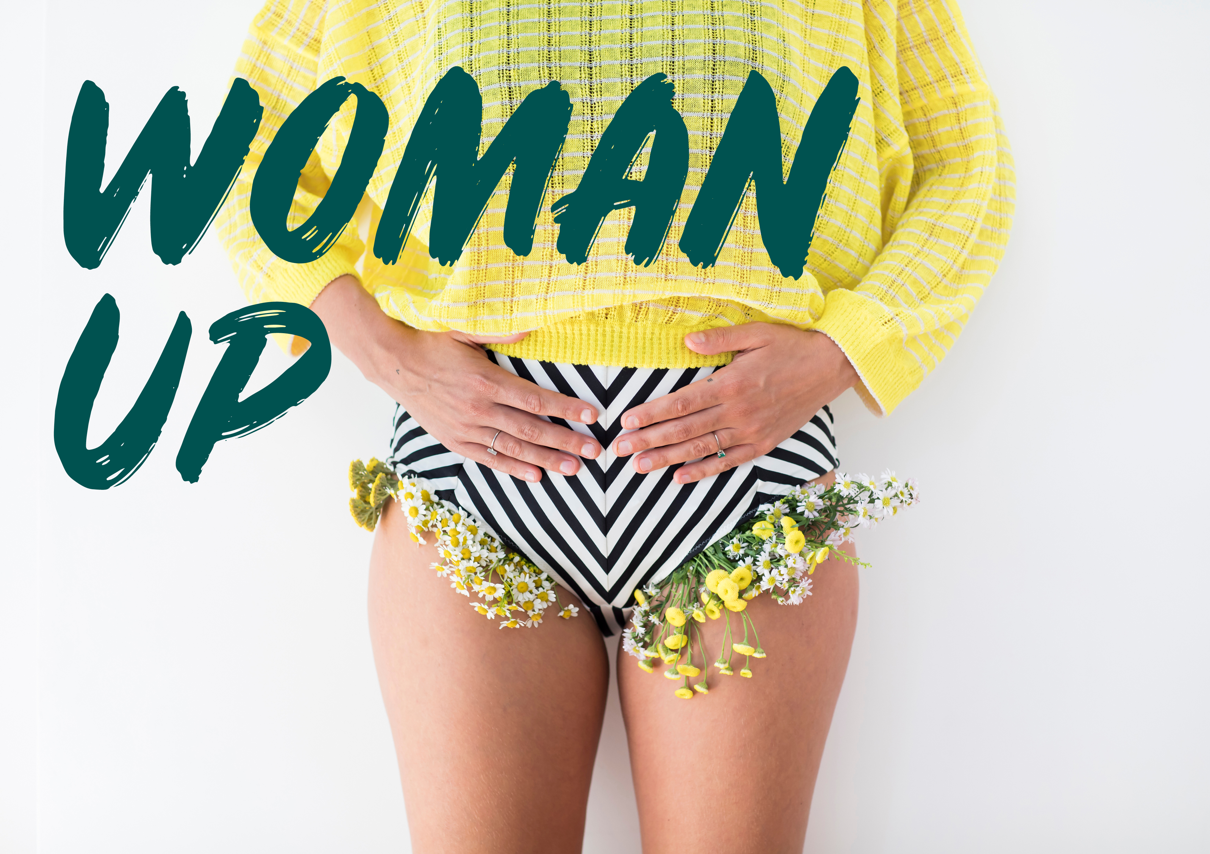
Today was the hottest day ever recorded in Belgium… It was also the day that I sent Eva Daeleman’s new book Woman Up to publisher Horizon to be printed (three days early by the way, but who’s keeping count).
What a pleasure to work on: super interesting to read, beautiful pictures (taken by Ellen van den Bouwhuyzen and styled by Eva), and I was encouraged to create a bold design with strong colours (lots of yellow, pink and dark green).
Can’t wait to hold this baby in my hands.

1 July 2019
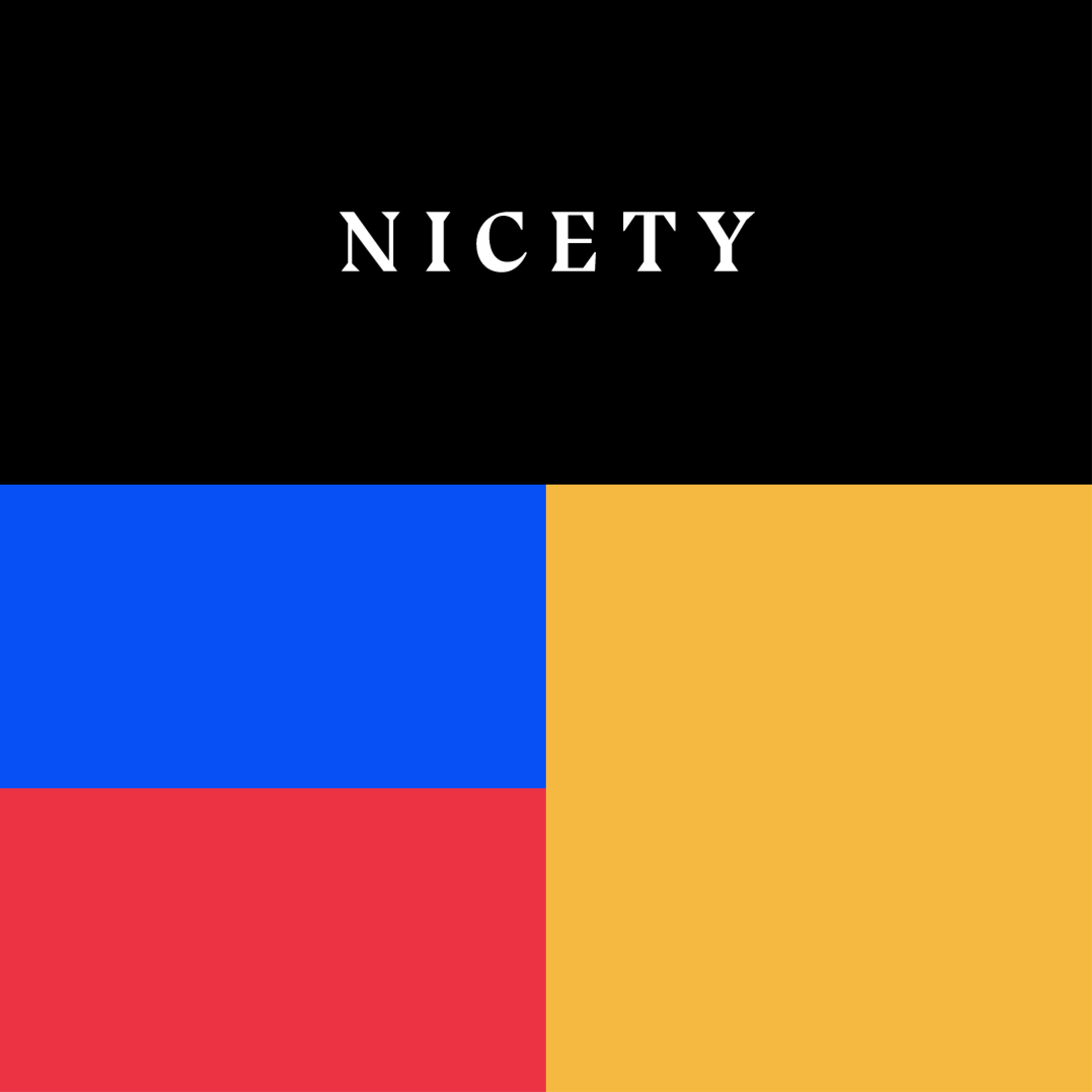
Collaboration with Nicety
Two London-based friends of mine, Sthuthi Ramesh & Sebastian Grenzhaüser (we all met at the London College of Communication), recently founded Nicety – an expert-curated, free and independent online library that makes it brilliantly simple for designers and makers to find the right materials and processors for their projects.
They asked me to come on board to help out with research, curation and communication. It’s still a work in progress, but follow us on Instagram and sign up on the Nicety website to browse papers, curated collections and processors from all over the world.
11 June 2019
Coming soon!
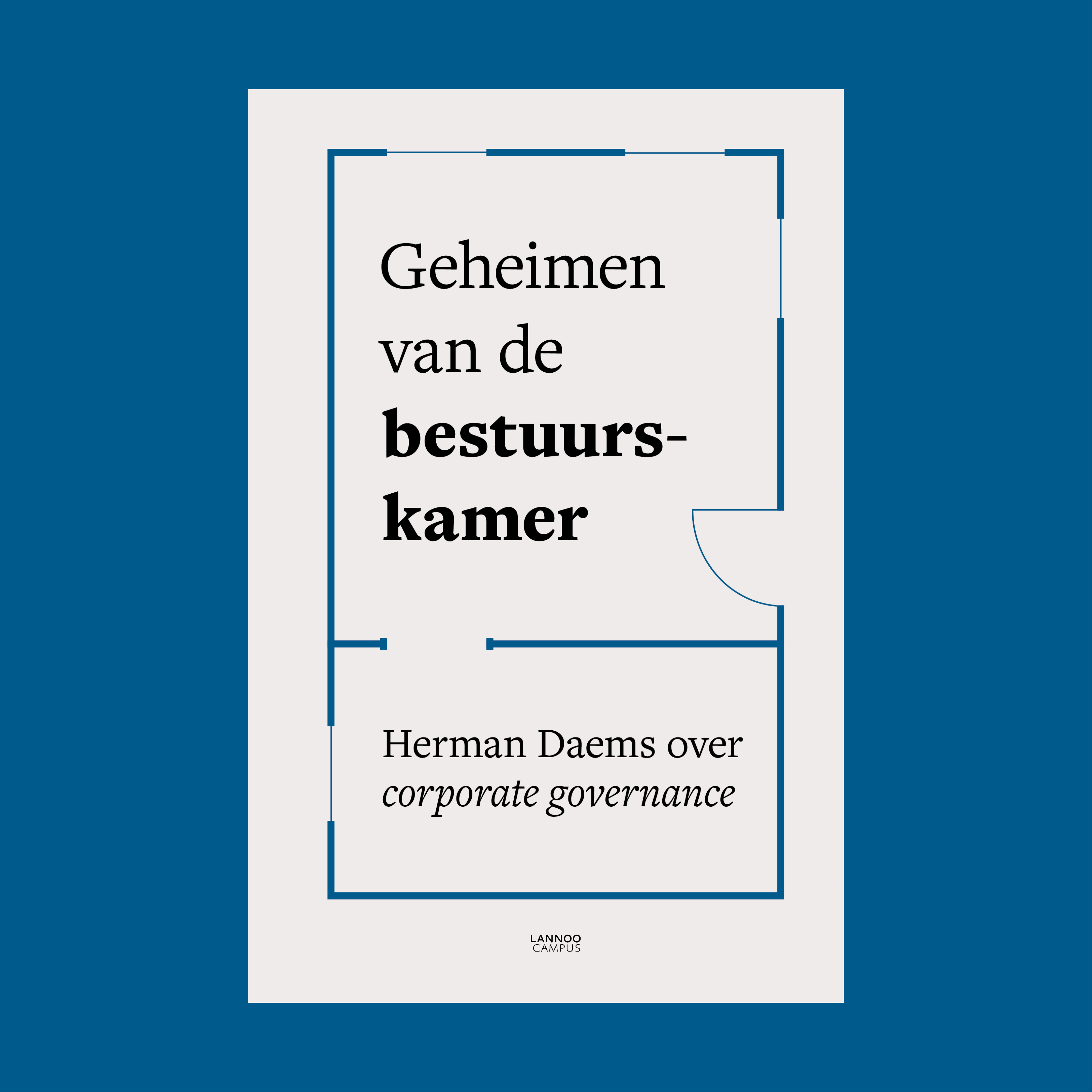
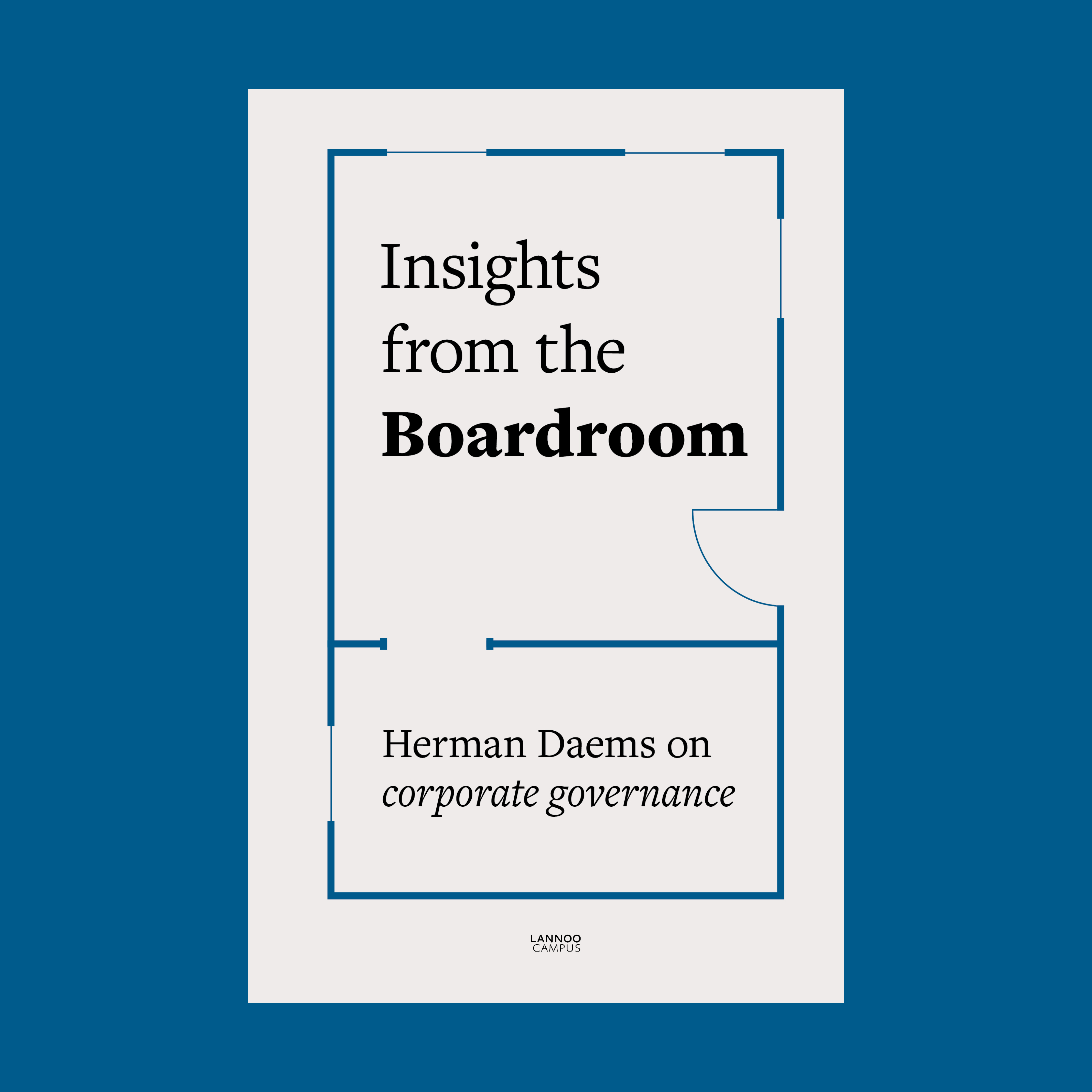
Cover design for Geheimen van de bestuurskamer written by Herman Daems and published by LannooCampus. The book talks about the inner and outer workings of Boards of Directors and how to ensure good corporate governance. The title refers to what happens inside a boardroom, so I created the look of an architectural blueprint. It will also appear in English as Insights from the Boardroom and in French as Les secrets des administrateurs. Out this fall!
Cover design for Geheimen van de bestuurskamer written by Herman Daems and published by LannooCampus. The book talks about the inner and outer workings of Boards of Directors and how to ensure good corporate governance. The title refers to what happens inside a boardroom, so I created the look of an architectural blueprint. It will also appear in English as Insights from the Boardroom and in French as Les secrets des administrateurs. Out this fall!

16 May 2019
Coming soon!
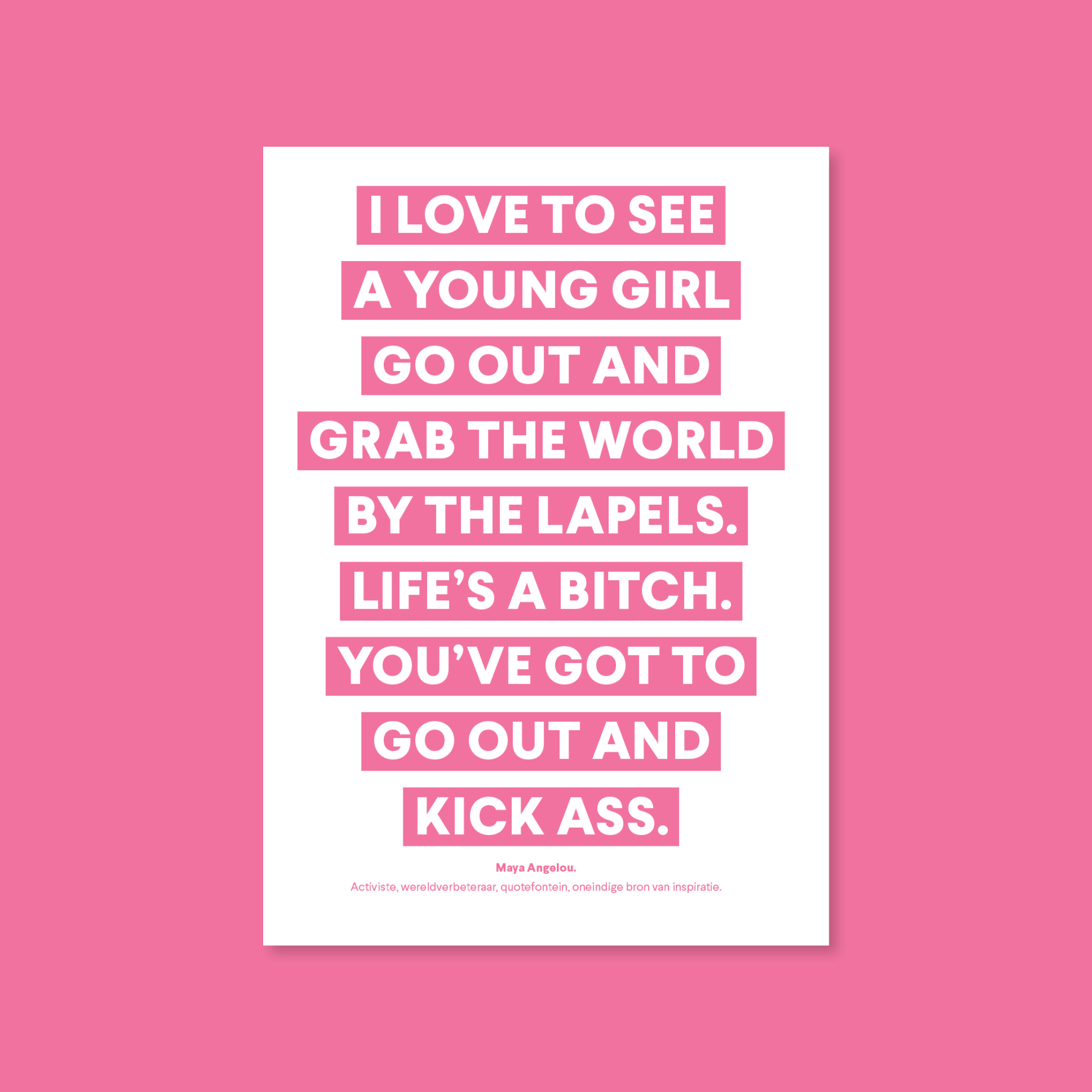
The cover design for Eva Daeleman’s fourth book, Woman Up, was released this week. I will be working on the layout of the inside pages over the next few months and the book will be in stores in August.
The cover design for Eva Daeleman’s fourth book, Woman Up, was released this week. I will be working on the layout of the inside pages over the next few months and the book will be in stores in August.
9 May 2019
L.capitan PrintAcademy #9
Piet Germonprez is one of the people that came with us to Munkedal (see post below). We had met five years ago, when he ran Pure Print (where Kitchen Lab was printed). Now he is CEO of the coprinting company L.capitan. Very passionate about his job and his company, he invited us to attend the ninth edition of their PrintAcademy, a lecture night and tour around their printing facilities.
It was an incredibly interesting evening with talks by Olivier Dengis about colour reproduction in offset printing, Patrick Bakermans of Hexspoor about softcover binding and Willem Vangeel of Brepols about hardcover binding.
7 May 2019
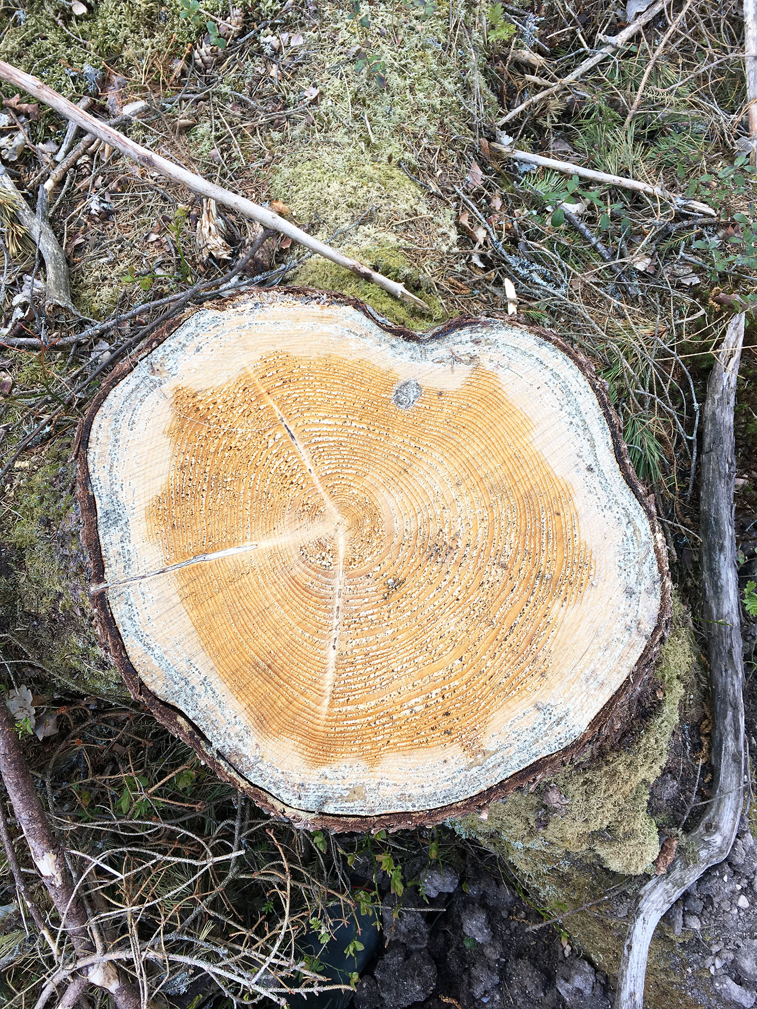
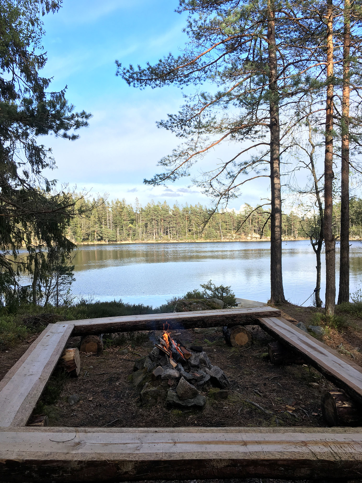
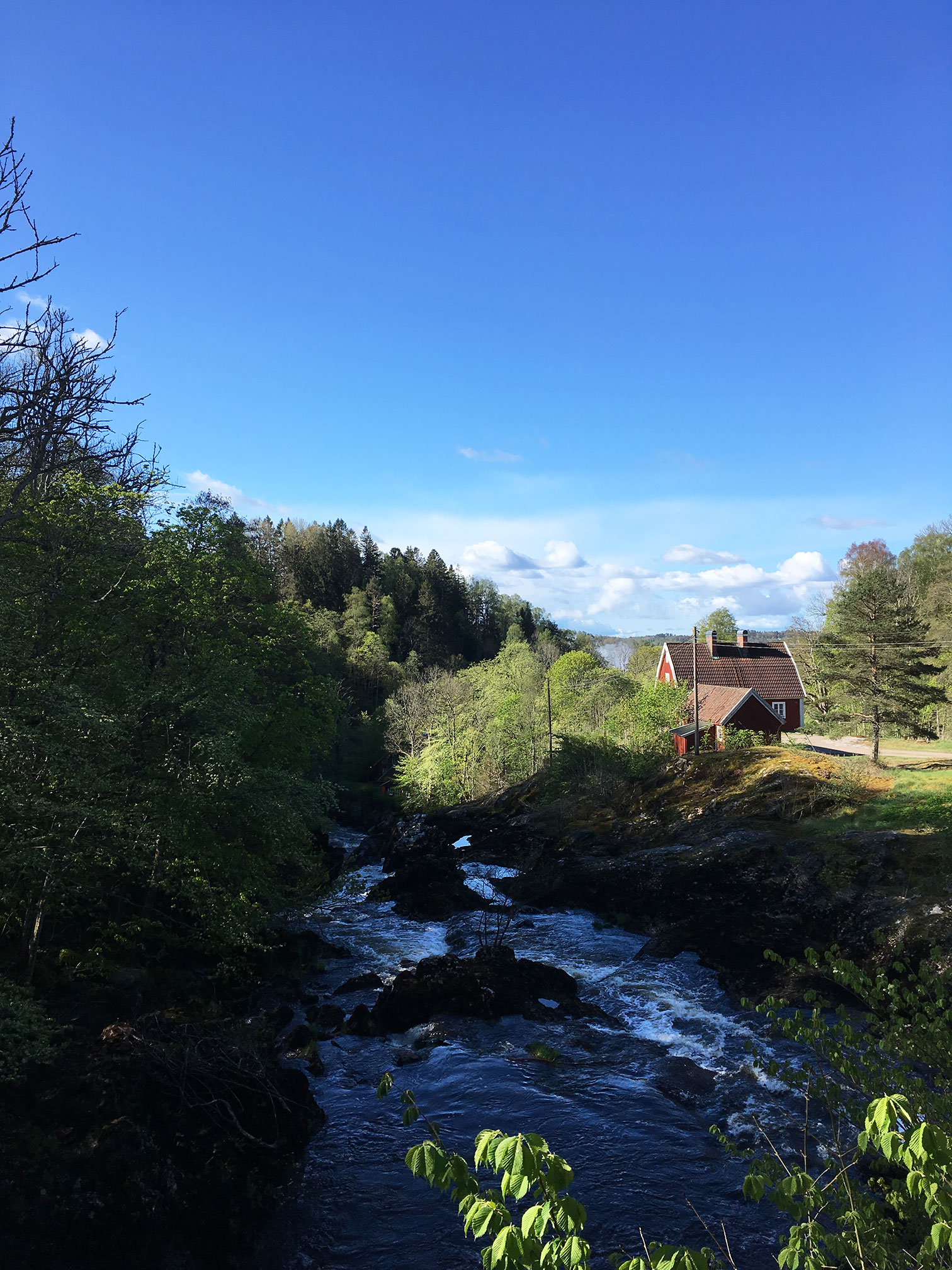
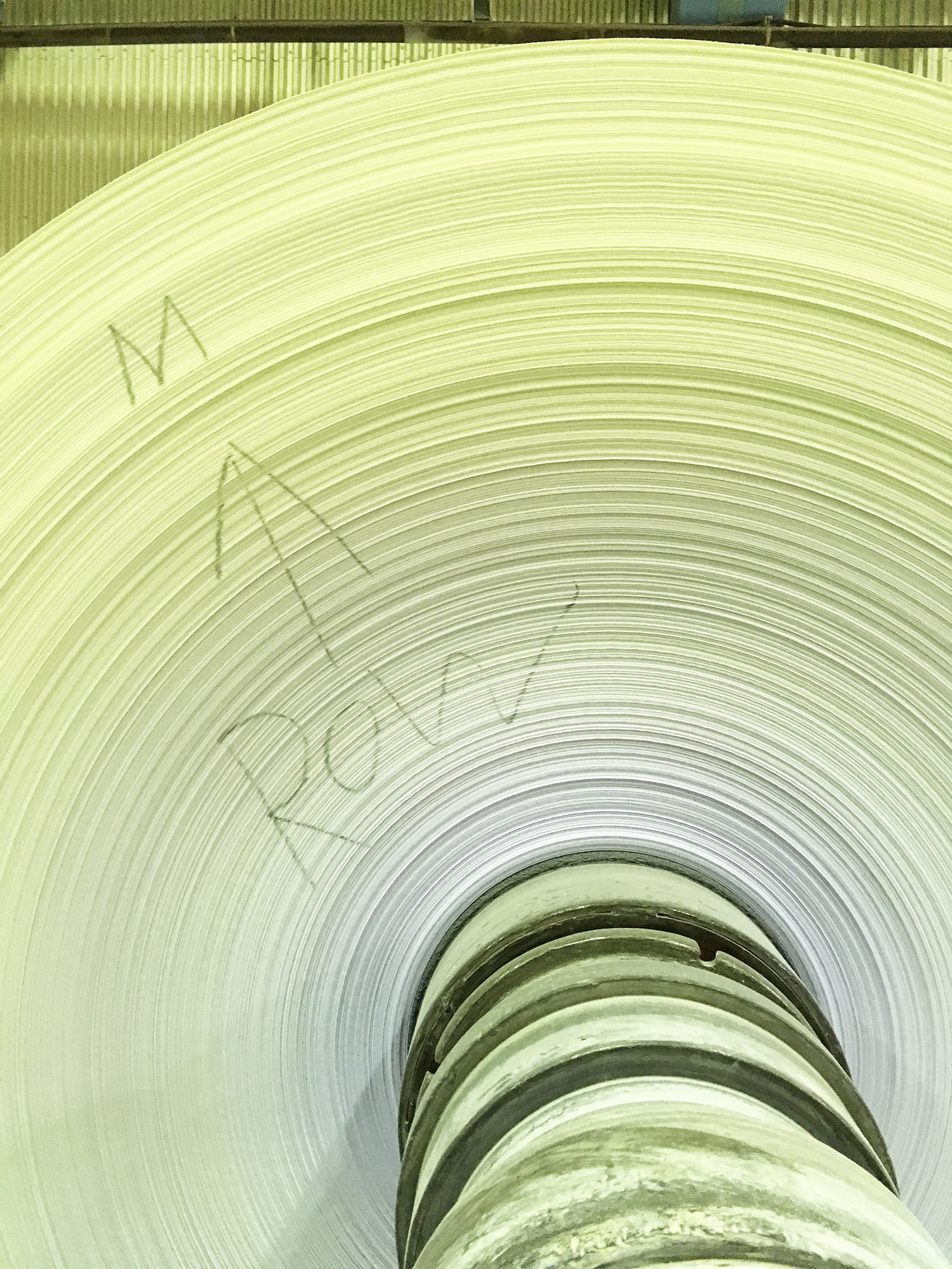
Visiting the Munken paper factory in Sweden
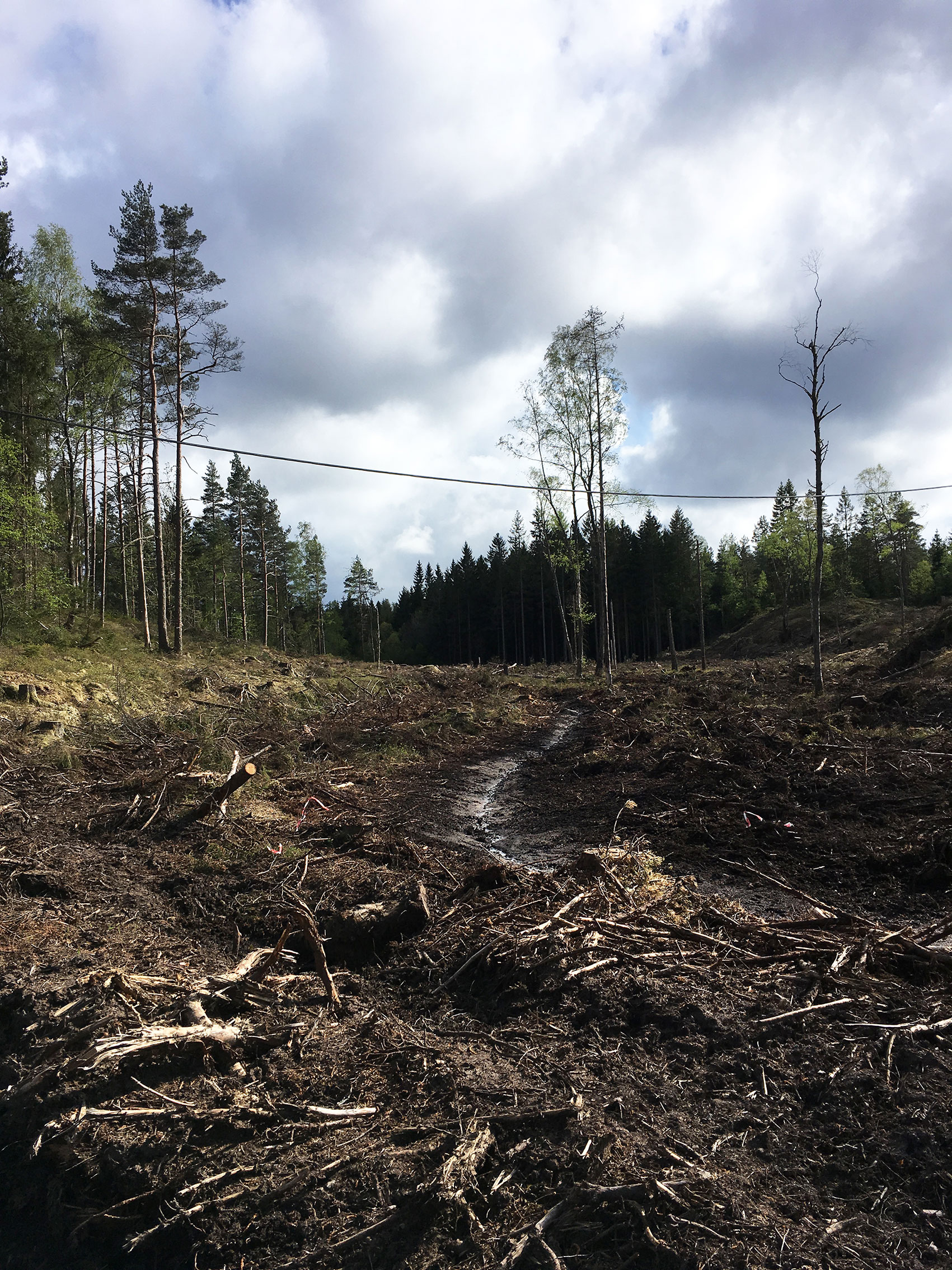
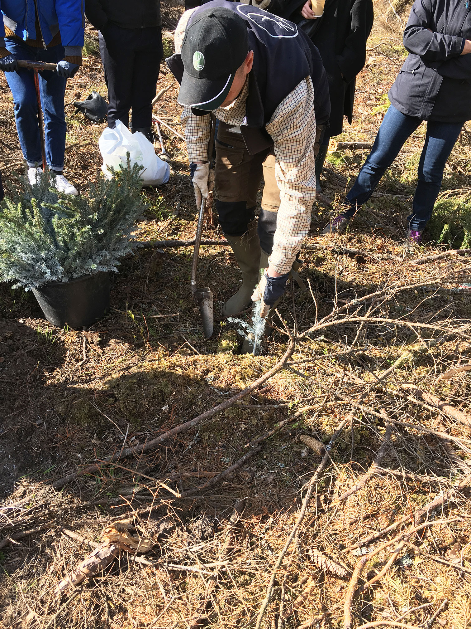
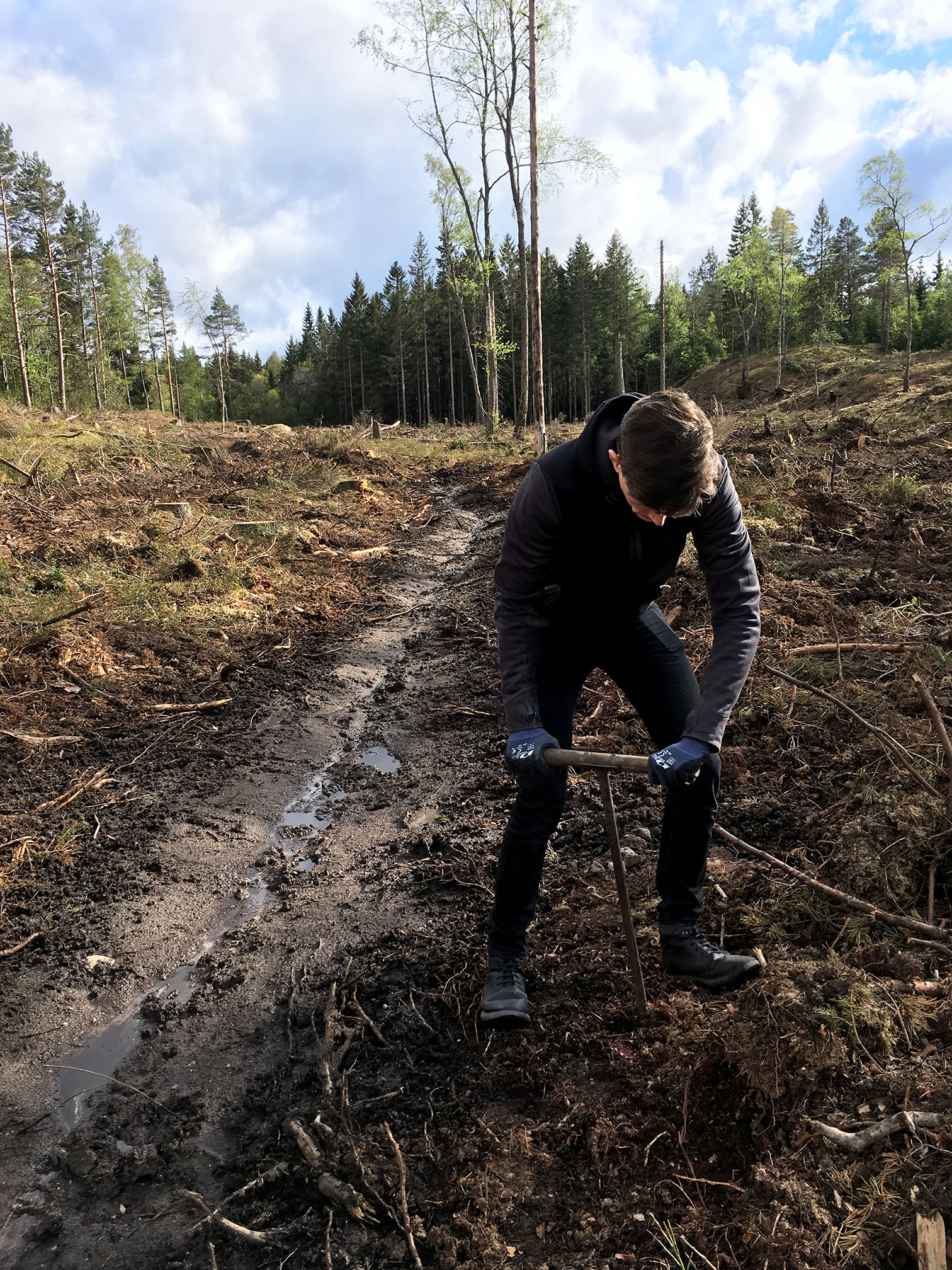
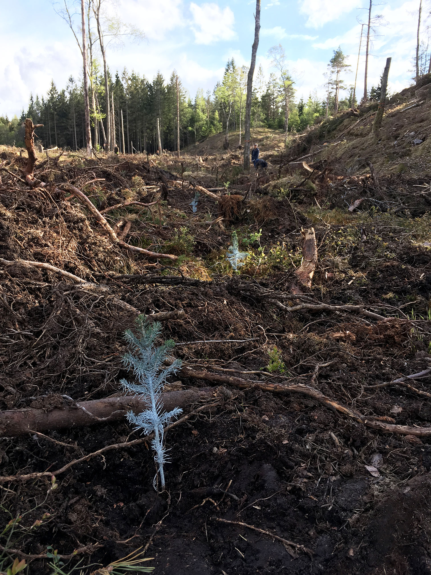
A few years ago, An De Coster of Arctic Paper Benelux invited me to visit the Munken paper mill in Munkedal, Sweden. I had heard about these group trips (and how great they are) from co-working buddy Pieter Boels, but the timing was never right. So I was very excited when the dates worked out this year. When I heard who else was joining us on the trip, I was even more excited. Lots of people I’d heard about but never met! My partner Mathieu – who is taking evening classes in graphic design – was also welcome to join the group.
We flew to Gothenburg on Monday morning. On the way to Munkedal, we stopped for lunch at a tiny, charming restaurant by the seaside. After checking into our hotel, we drove to a recently cut-down bit of woodland. Martin told us about forestry in Sweden, how long it takes for a forest to grow, which trees are best for making paper, and other interesting facts. Together we replanted about 200 spruce trees in a couple of hours. In the evening we drove to a wooden cabin located at a lake and had a lovely dinner (and sauna).
On the second day we visited the paper factory, a short walk from the hotel. Jonas, the Group Environmental Coordinator, talks us through the basics of papermaking and lead us around the various areas of the factory. They make a very concious effort to work sustainably and effectively, and we were all impressed. So all in all: an extremely interesting couple of days!